

The original Rock ‘n’ Roll McDonald’s in Chicago was built in 1983 at 600 N. Clark Street. It was later torn down and replaced with a new, larger Rock ‘n’ Roll themed building that opened in April 2005. This iconic themed location was eventually demolished and replaced by a modern, non-themed flagship restaurant in 2018.
For those who like a timeline:
- 1983-2005: Original iconic Rock ‘n’ Roll McDonald’s
- 2005-2018: Larger Rock ‘n’ Roll-themed McDonald’s (with giant arches)
- 2018-present: Corporate boring eco-friendly McDonald’s
I just watched an 18-minute video called “The McDonalds that Defined an Era: The Death of a Chicago Icon” by Chunklight Twona, about the history and eventual demise of the Rock ’n’ Roll McDonald’s in Chicago. It’s really good. And I’m especially glad the creator went there on the last day. Someone actually documented it on its final day of existence. That alone makes this a historical video.
First off, the video shows you what the original Rock ’n’ Roll McDonald’s looked like in the 1980s and 1990s.

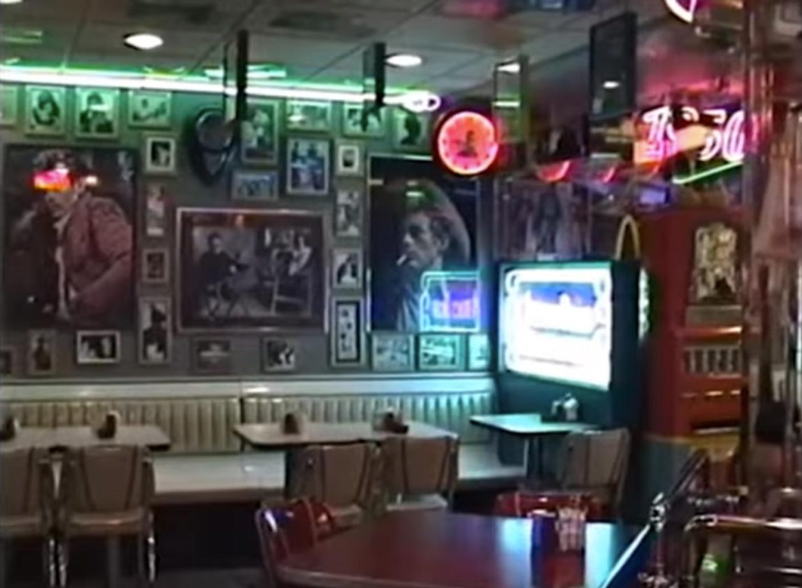
I’ve been to the original Rock ’n’ Roll McDonald’s as a kid and as a teenager. What always stuck with me was how dense it felt. They packed so much into that space. Everywhere you turned, the walls were covered with memorabilia. It felt like a physical collage. No empty space. No minimalism. Just layers of stuff.
I also spent a good amount of time in the 2005 version.
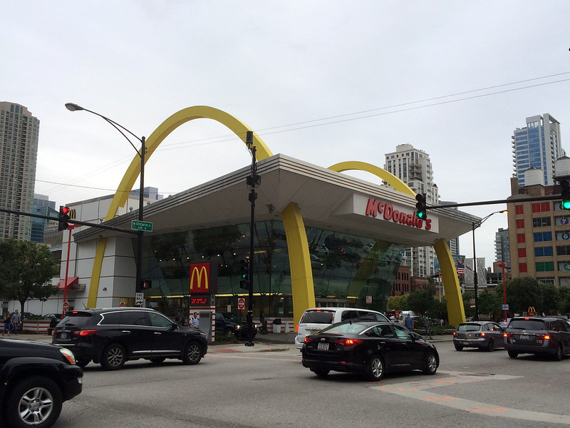
I worked at Tribune Tower from 2000 to 2018, so it was basically my McDonald’s for over a decade. I liked that version too, but it never felt quite as rich. Part of that is just scale — the 2005 building was huge. Anything you put inside it is going to feel a little dwarfed by the architecture.
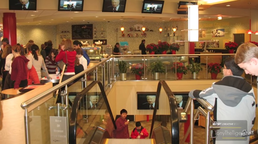
I haven’t even seen the new one. In fact, I didn’t realize they tore down the 2005 version until watching this video.
And wow. The 2018 version. Zero charm.
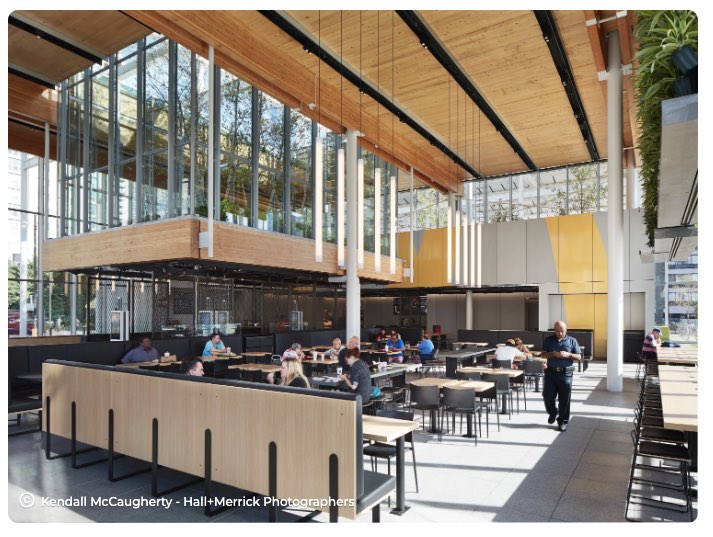
Here’s my theory: this building probably looked amazing in computer renderings. I’m sure the mockups were slick. All sharp lines and glowing surfaces. That second-floor greenhouse thing? In the concept art it probably screamed: “We are eco-friendly to the MAX.”
But then it got built in real life, and it’s just… underwhelming. Flat. Corporate. Bland.
And yes, you can say “everything is corporate and bland now,” but I think it’s deeper than just branding. I think it’s about how we design and build things now.
We don’t really build things as we go anymore. We pre-build them on screens. Everything is mocked up in software first. There’s no one sketching loosely on paper, no one ad-libbing in the process. No moments of, “Hey, we’ve got this weird corner here — what if we stick this thing there?”
Now it’s all 100% premeditated. Locked in. Approved. Rendered. The computer screen becomes the reality.
And the computer screen lies.
It adds perfect lighting. Perfect reflections. Soft glows. Beautiful atmospheres that don’t exist in the real world. Then you build the thing, and real sunlight hits it, and real materials reflect it, and suddenly it’s just… meh. The magic was in the rendering, not in the building.
When they built the original Rock ’n’ Roll McDonald’s, I can almost guarantee it was more like:
“Hey, we’ve got this empty wall — let’s throw these records here.”
“And we’ve got this weird space — stick a jukebox there.”
And they just kept fitting things together like a puzzle.
It had life because real humans were making real-time decisions in physical space.
The original wasn’t designed. It was assembled. And you could feel that when you were inside it.
I love this post Matt. I was only there once, and dense is the best way to describe the space. I love that the author was there on the last day too.
I had no idea they’ve gone through two other versions since then, but you’re thoughts on corporate design is so spot on. There’s no character. There’s no human touch. It’s only what looks good on the screen.
We are just in this weird phase of poor designed architecture
Hey Peter! I’m finally responding to your comment from four months ago. I just added a new WordPress plugin that should send an email notification when someone replies to your comment.
I hope you got an email notification for this response.
So you got to see the old Rock ‘n’ Roll McDonald’s! But not the one with the giant arches?
Charm… uniqueness… things that are going away in corporate America in favor of bland templated everything.
Where the local Starbucks that had a fire was able to reopen within weeks because it looks like every other one and they were able to truck in the same furniture, you lose the charm and warmth that goes well with a coffeeshop.
Someday we will look back on this and say, what were we thinking?