

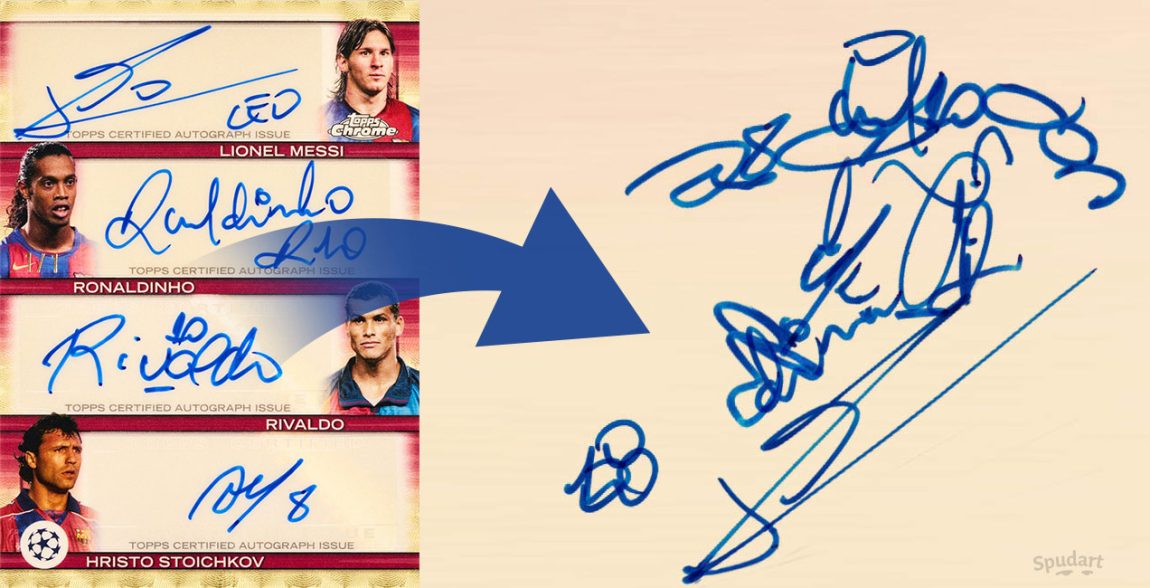
Here’s a fun idea: take a bunch of autographs, cut the shapes apart, and move them around into a new drawing.
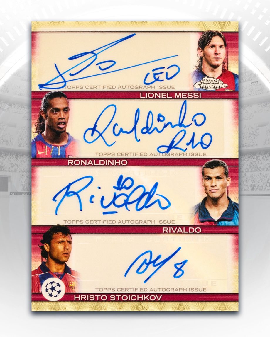
The inspiration came from this four-signature FC Barcelona card posted by Topps on Facebook. So many interesting curves, loops, and lines in these signatures—like raw material begging to be rearranged.
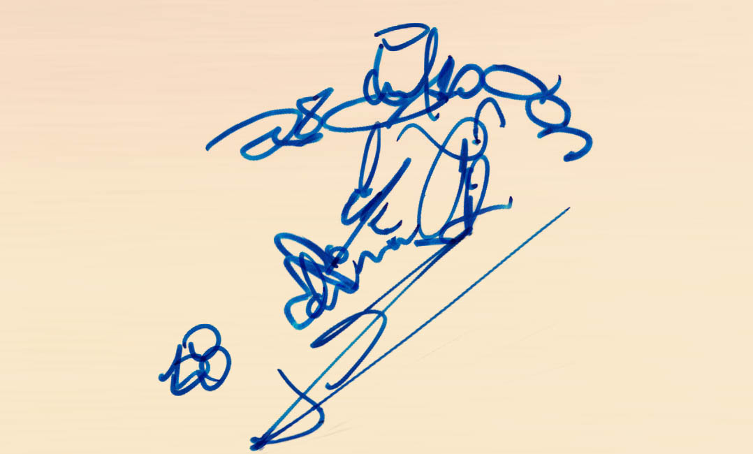
I moved the pieces from the players’ autographs around into new positions, and turned them into a new composition—a soccer player in motion, mid-kick, with a ball nearby.
It’s kind of a bummer that so many athletes today sign with such abstract autographs. You can’t really read their names—just loops, slashes, and squiggles. The personal touch of a legible signature is often lost. But if that’s the style, we might as well do something with it.
These shapes, while indecipherable as text, are full of energy. The loops, spikes, and arcs become raw material—like brushstrokes you can cut up and reassemble into something new. That abstraction makes them great raw material for an image like this. In some cases, I rotated a shape, but I mostly tried to preserve the original orientation. And I didn’t resize any of the shapes—all are kept at their original scale.
How I did it
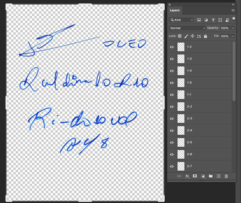
Using Photoshop, I started by isolating each autograph from the card.
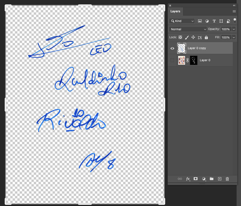
Then I broke each autograph into individual shapes and placed them on separate layers. I numbered the layers by player (1–4) and gave each fragment a sub-number for reference.
Where each player appears in the drawing
Lionel Messi
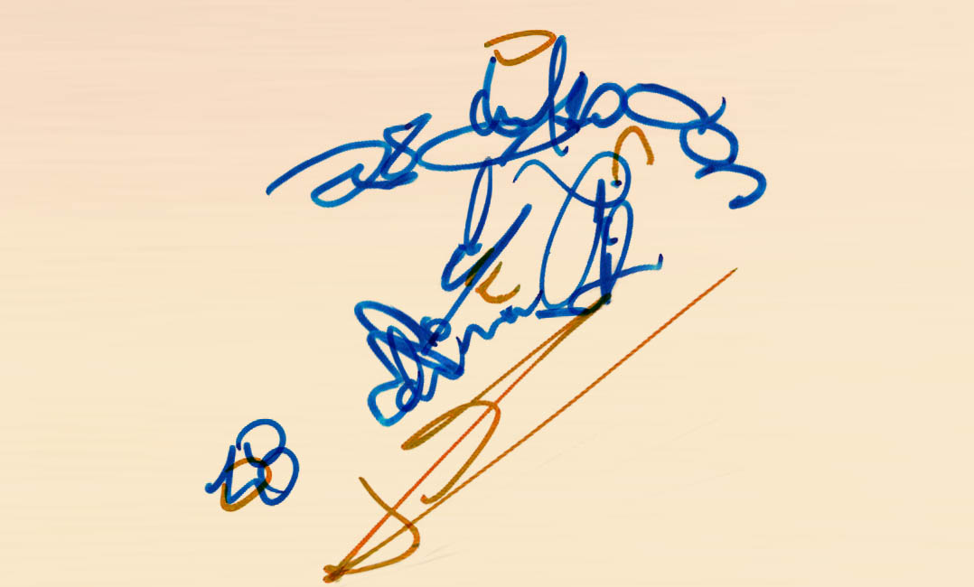
Ronaldinho
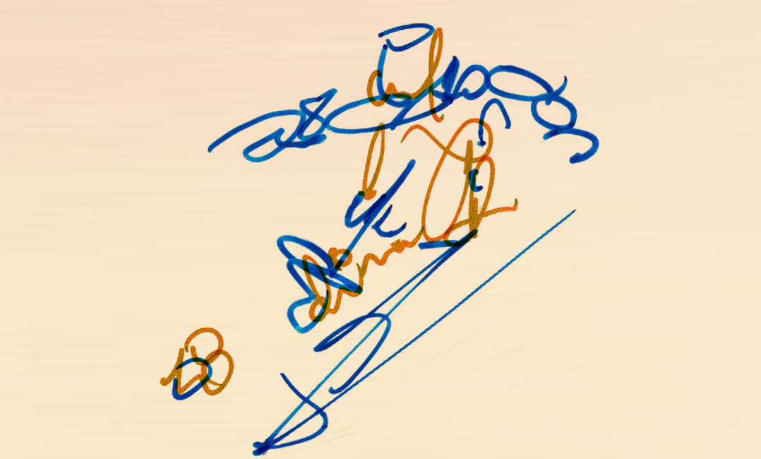
Rivaldo
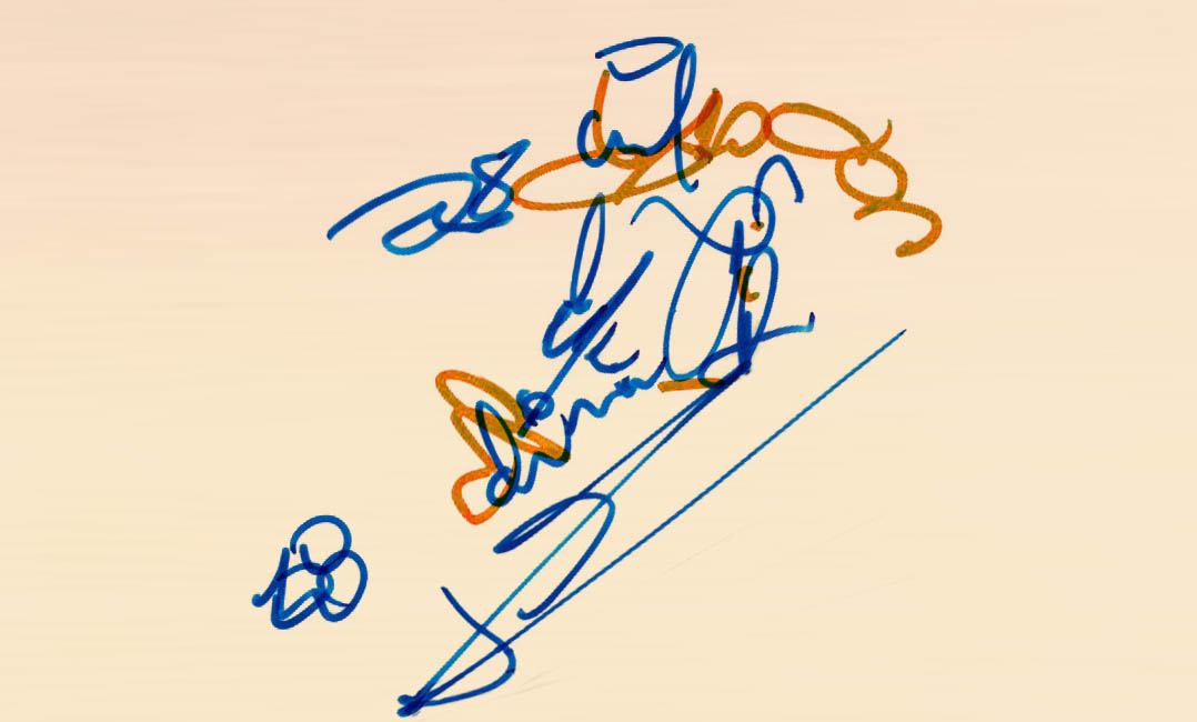
Hristo Stoichkov
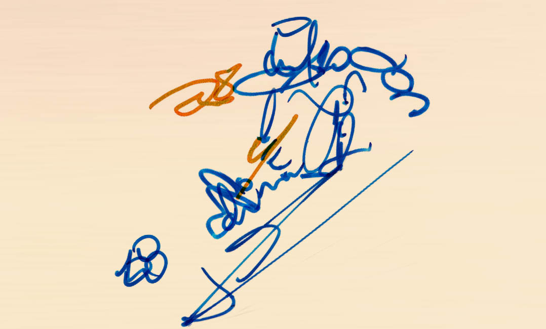
I like how the result turned out—it’s abstract, but you can feel the motion and shape of a player kicking a ball.
A few things I learned along the way.
1. One of the autographs needs to have a strong shape/line.
Messi’s signature includes bold lines that worked well as structural elements. When picking a reference image of a player in motion, I looked for one with strong, clear angles that the autograph fragments could echo.
2. The energy comes from the strokes.
Even though these are static lines, the loops and slashes feel dynamic. It’s like the signatures still carry the motion of the players’ hands—and their presence.
3. At least four autographs is crucial.
This probably wouldn’t work as well with just three. The fourth signature adds just enough variety and options to complete a full figure. For future pieces, I’ll aim for four or more.
4. Same color.
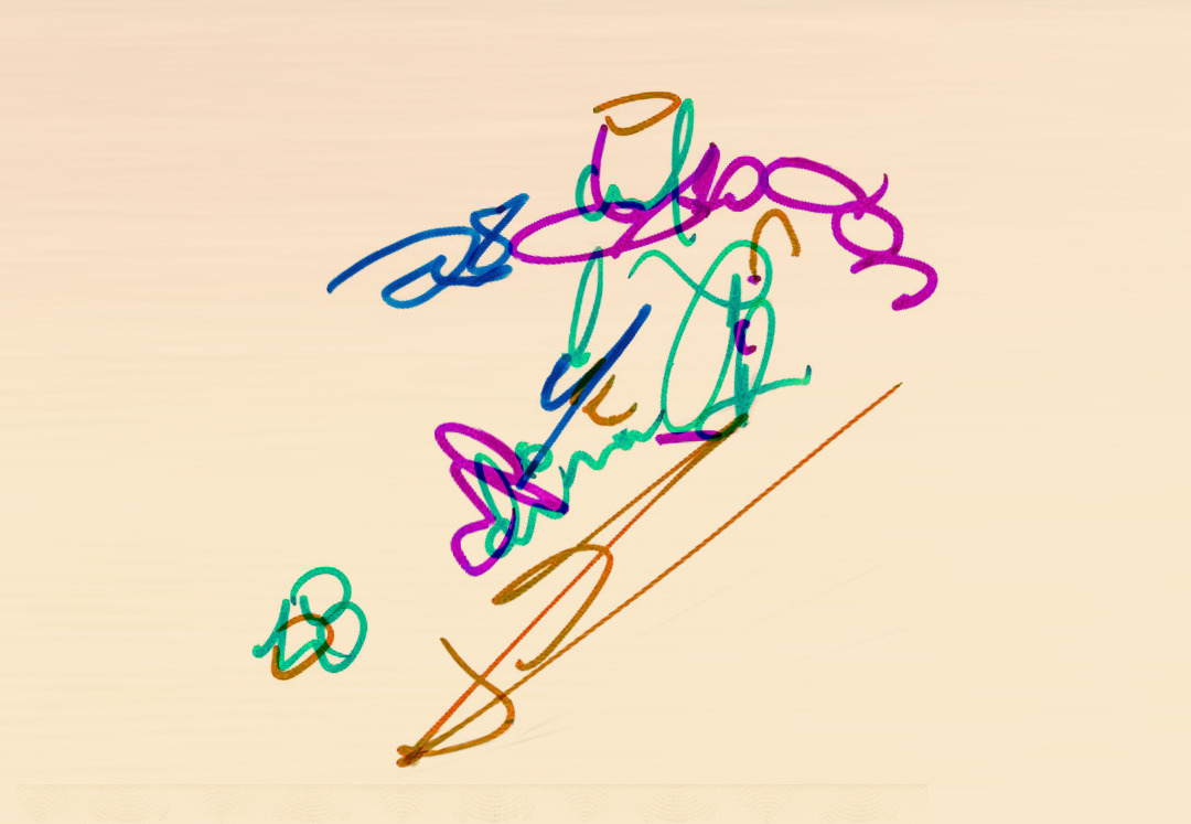
All the autographs are done in the same color. They might even be with the same pen. This helps to create cohesion in the final illustration. Although, who knows? Maybe it will be cool if there are different thicknesses or colors. I tried a version of this where each player had their own color, and it didn’t turn out that great. It was too jumbled. The various colors were distracting to the overall shape.
Next Steps?
There’s something fitting about reimagining an athlete’s autograph into a visual that reflects motion, energy, and action. Sports autographs already carry so much dynamic flair—looping lines, fast strokes, and bold marks. It just makes sense to remix them into something that captures the spirit of the game.
I’m curious to try this with other sports—maybe baseball swings, basketball dunks, or football catches. I’ll keep experimenting and see what other stories can unfold from the lines of a signature.