

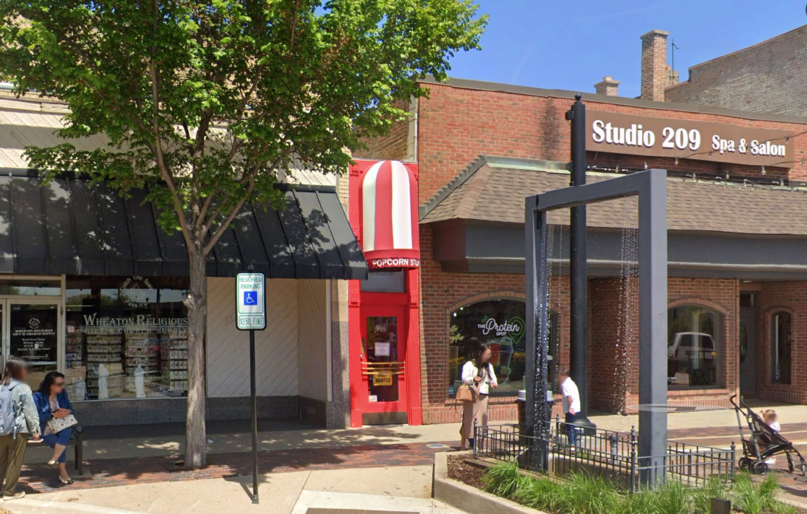
There’s a popcorn store in the town next to mine that is 49 inches wide. Four feet and one inch, wedged between two buildings since 1921, painted bright red so you know it’s actually a store and not a gap.
I’ve been writing letters on aluminum foil and mailing them to people. The way it works: wrap a clipboard in foil, hold it up against something in the world, and whatever it is lands in the surface. Then write your letter on top of the reflection. By the time the letter arrives, the reflection is long gone, and the person holding it sees their own room behind my handwriting instead.
This one went to Lyle, from a table outside the Little Popcorn Store in Wheaton, Illinois. You can write one too, and I’d love it if you did. Here’s how. The series is #lettersonfoil.
Nine years
I’ve lived in this town for nine years, and I never knew about the Small Popcorn Store. WBEZ wrote about the store. Normally in my little suburb, there aren’t many unusual things to report on. It’s pretty much straight-up suburban life. Personally, I would prefer an urban one, so when there is something unusual in my town, I gotta check it out.
The shop is only 49 inches wide. Nestled between two buildings since 1921! With a bright red exterior to identify that, yes, this is its own store. It’s so cute. I had to include this in the #lettersonfoil series.
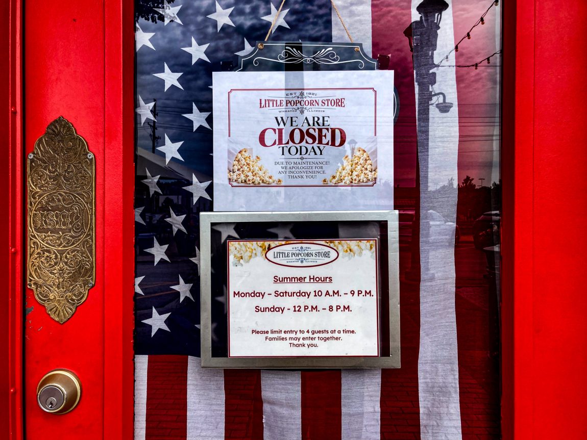
My first bike ride to the store ended with the store being closed for the day for maintenance.
No problem. It’s not far away at all, in the town next door to mine. The day I came back to the store, I didn’t intentionally plan. It just so happened to be on the same day when I placed my first plastic treasure chest in my town.
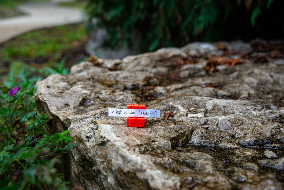
I can’t believe I’ve lived here for nine years, and I never placed a treasure chest here. When I did that art series in the city, it was my go-to whenever I needed an easy way of getting back into the creative groove. Put out some treasure chests, and now my mind and body are back to thinking about creative projects. I put out over 900 chests.
Then I had a nine-year drought. The treasure series kinda died out in the suburbs. I have to admit, the city does a lot of the carrying meaning when I place them in places. Putting a treasure chest in a regular vanilla parking lot just doesn’t carry the same weight as putting one on Tribune Tower.
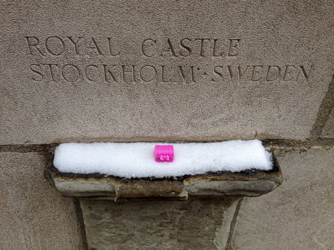
Or on a lamp in Jeweler’s Row.
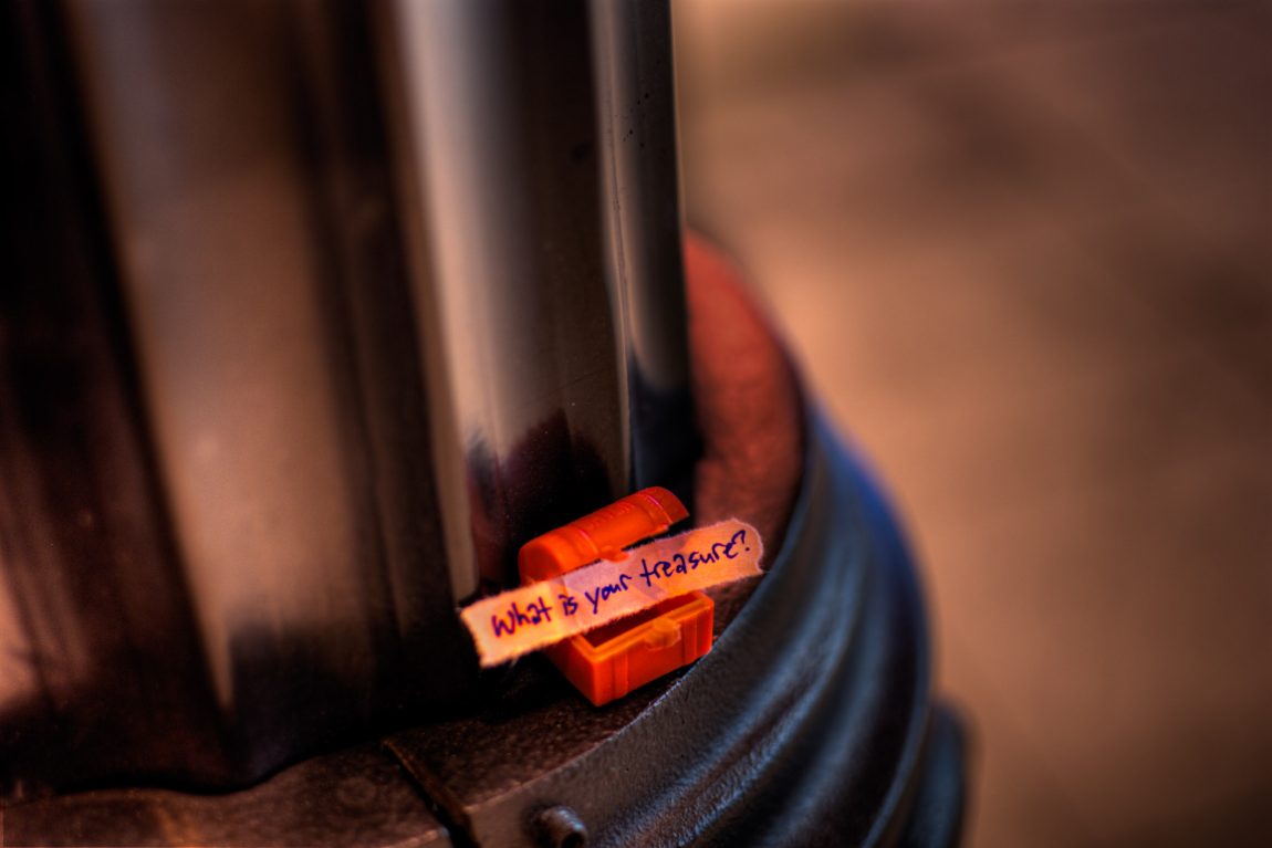
When life gives you lemons, you make lemonade. So I’m starting the series again. Plus, with my blog’s 25th anniversary coming up, I’ve found myself digging back to the fun art projects during that time (new art section with six projects, archived list with 33 projects). It’s fun bringing them back to life.
Red
There’s also this interesting visual commonality. The treasure chest is red. The reflection in the foil is very red. Oh wait. I didn’t share any pics of the “Letters on Foil” at the Little Popcorn Store. Here’s the start of the letter.
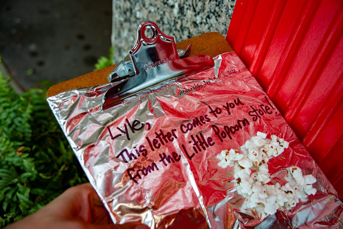
The red treasure chest from the morning and the red in the foil went together so nicely. One of my favorite treasure chest placements is the red treasure chest on the graffiti-covered construction scaffolding.
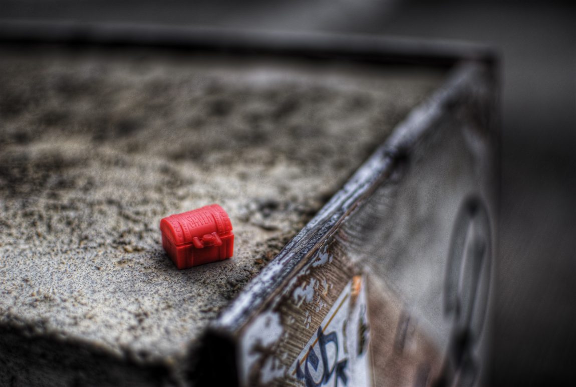
Lots of red. But what else? I never really plan out what I’m going to write in these letters. This one is a bit scatter-brained.
Transient nature
When I think about what to write with this series, I think about things that are transient. They are here, and then gone. The reflections in the foil exist, and then they don’t. What else is like that?
One time I sat in a grocery store parking lot, eating an orange.
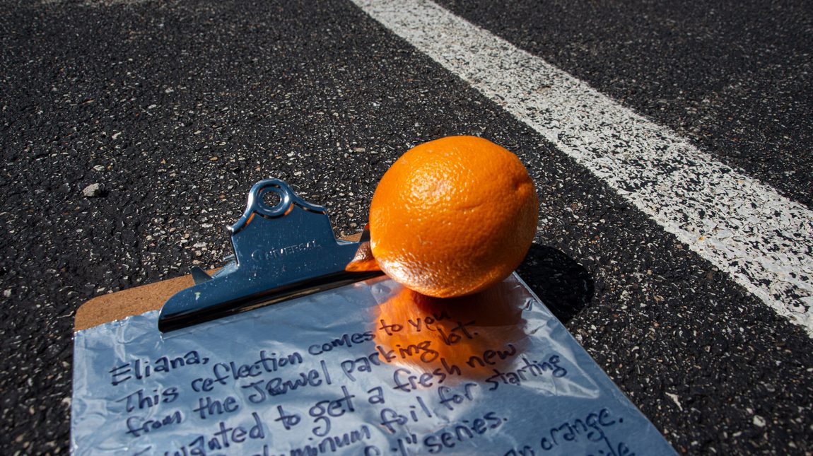
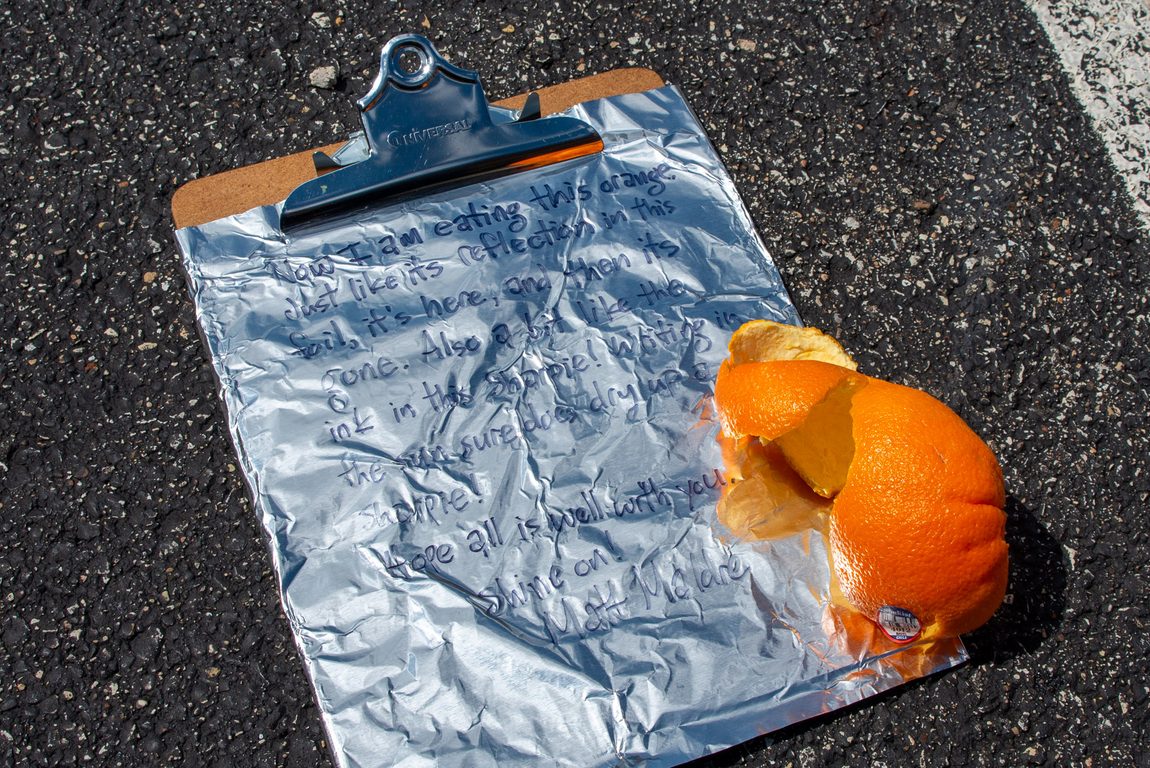
The bright orange looked great on the foil. I snapped one photo of that. And then when I was done with the orange, I snapped a photo of the orange peel. The peel indexes to the orange being consumed. Enjoyed and gone.
The letter by the Tony Fitzpatrick mural spoke of death. The artist Fitzpatrick died last year. He was here and then he isn’t. But his murals remain. A bit like the butterflies often seen dancing in his mural next to skulls.
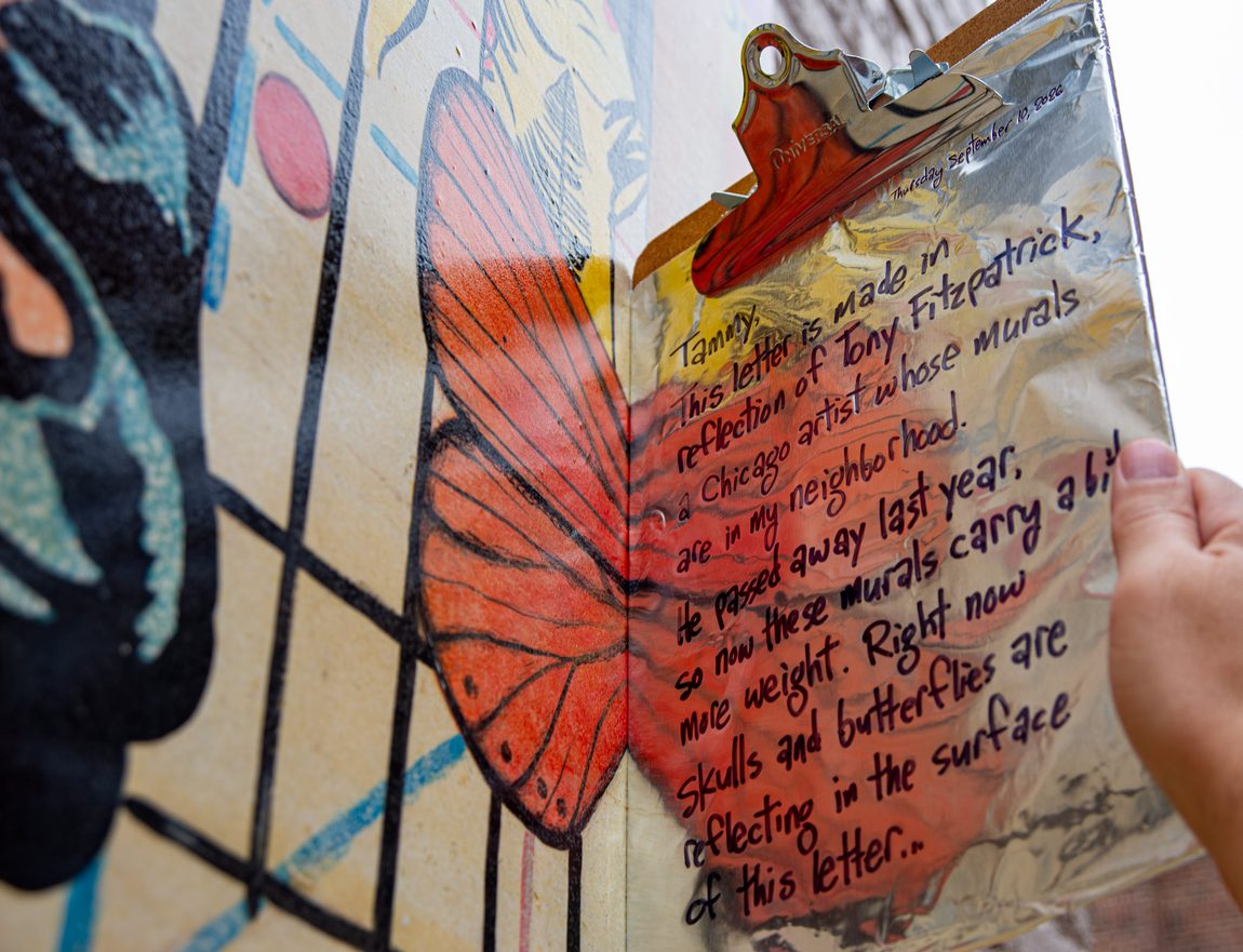
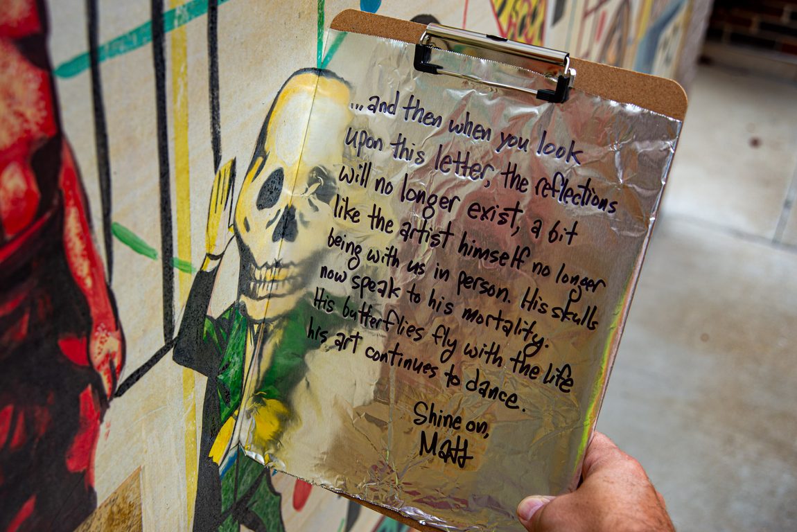
Storefront qualities
What about this storefront?
- Unique tiny size
- Bright red color
- They sell popcorn. Popcorn, something that in an instant transforms from corn kernel to popcorn kernel. And then the popcorn doesn’t last long, it’s eaten pretty much as soon as its transformation occurs. Never sitting on the shelf more than a day.
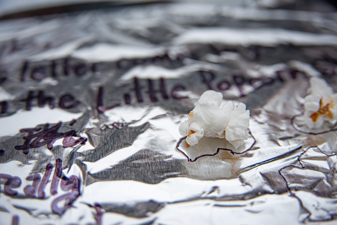
I captured photos of the popcorn on the foil. The reflections existed for a moment. This time I introduced something new into the series—I traced the outlines of the popcorn onto the foil. A remnant remains. The shapes are unusual. Take one shape by itself, and you might not know it is a popcorn kernel. But together, they look a bit like popcorn. I found it challenging to trace popcorn on aluminum foil. Push down too hard on the popcorn, and it breaks in half, changing the very shape I was trying to capture. Push too gentle, and that light fluffy object moves around.
That’s pretty much what the letter said. I didn’t get as deep as I would have liked in the contents of the letter. Perhaps I might revisit this location for a future letter when I ponder more the meaning of all these aspects colliding at once.
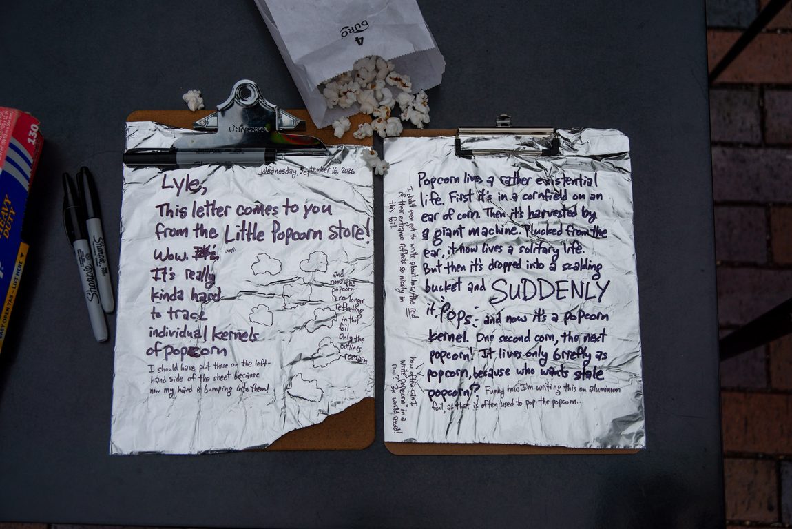
Wednesday, September 16, 2026
Lyle,
This letter comes to you from the Little Popcorn Store! Wow. It’s really kinda hard to trace individual kernels of popcorn. (I should have put these on the left-hand side of the sheet, because now my hand is bumping into them!)
(and now the popcorn is no longer reflecting in this foil. Only the outlines remain)
Popcorn lives a rather existential life. First, it’s in a cornfield on an ear of corn. Then it’s harvested by a giant machine. Plucked from the ear, it now lives a solitary life. But then it’s dropped into a scalding hot bucket, and SUDDENLY it POPS, and now it’s a popcorn kernel. One second corn, the next popcorn! It lives only briefly as popcorn, because who wants stale popcorn? (Funny how I’m writing this on aluminum foil, as that is often used to pop the popcorn)
(I didn’t even get to write about how the RED of their entrance reflects so nicely in this foil)
Shine on,
Matt
Being the unusual guy
The act of creating these letters is a bit of a trip for me. Meaning, I am amused by them. Here I am sitting with a bright green bike helmet on. Wearing a bright green vest. Backpack with bright green stripes. Holding a clipboard with aluminum foil. Writing on the foil. When I’m done with one letter, I leave it on the clipboard, and set it aside. And I pull out my “Reynolds Art” roll and rip off another sheet.
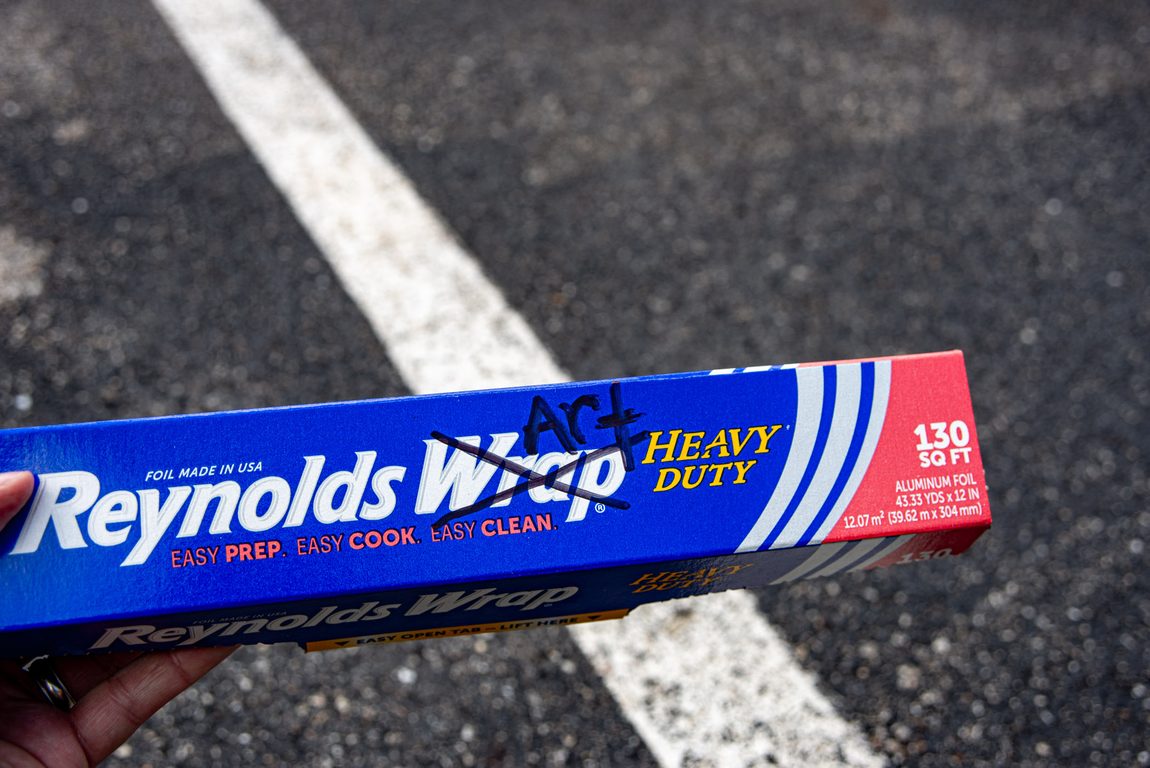
I could feel people looking at me wondering, “whatthe?” I never make eye contact. Nobody has asked me. Maybe I look like a kook. “There really aren’t crazy people here. Is it possible that some madman lives in this area? That’s not possible!”
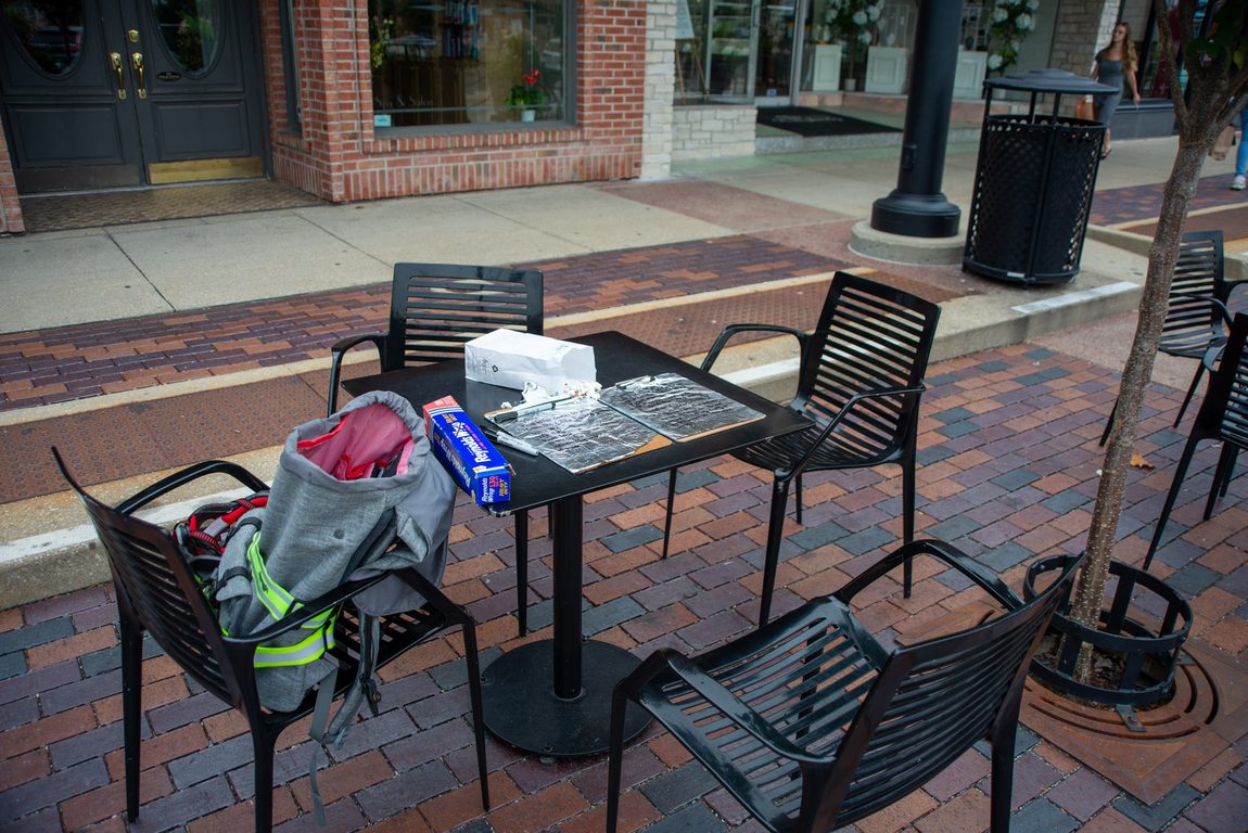
Perhaps I should make eye contact with people, so they feel more encouraged to ask me questions. I could hand out a business card with my website address. I could carry around cards with aluminum foil glued onto the back. Their own little artwork to carry around and hold up to surfaces to see how the colors reflect.
The nature of foil reflections
Actually, that act of reflecting in the foil is fascinating to me. I don’t know what it really is yet. But it’s not just a mirror. Not a straight-up reflection. But it’s warped a bit. You truly get a sense that this is a real material in your hands. Yet, this real material is showing things around you. And you can’t really get any reflections in the foil unless you go RIGHT UP TO THE SURFACE. You have to literally TOUCH the surface of whatever it is… a flower, a red wall, a mural. You need the foil to touch that surface. It has to be intimately close to the surface. Then and only then, you get the object captured in your foil.
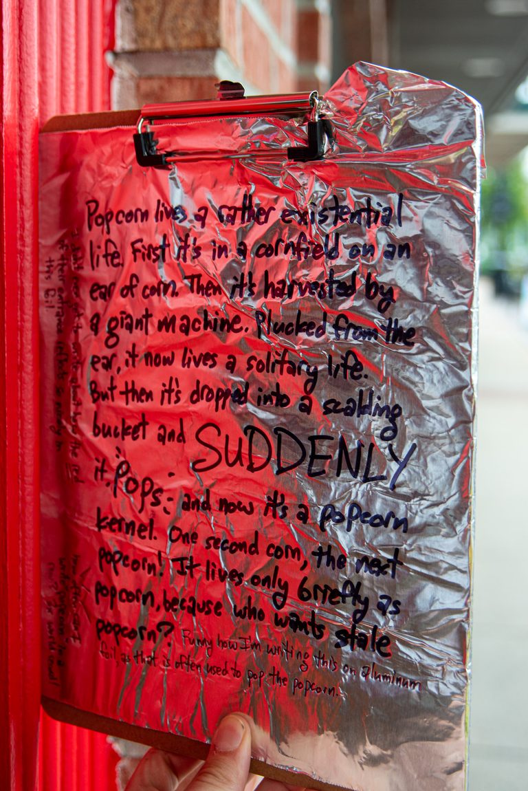
It’s a bit like carrying a tiny lake with you. And you get some awesome reflections in the lake. But it’s a lake in your hand. The reflections aren’t a mirror-like reflection. But they are somehow IN that lake.
The reflections are IN that foil. Almost like it’s some sort of time-space warp. An alternate universe. For that moment. And then it’s gone.
Relating to art history
The red in this storefront entrance is just something else. I want to ponder that a bit more. When mailing this letter, I want to include an artwork that is pure red. I seem to recall the Art Institute of Chicago having a lot of red, like pure red, artworks.
The museum’s website has a nice tool to search the collection by color. I set that color wheel to red, and see what we get.
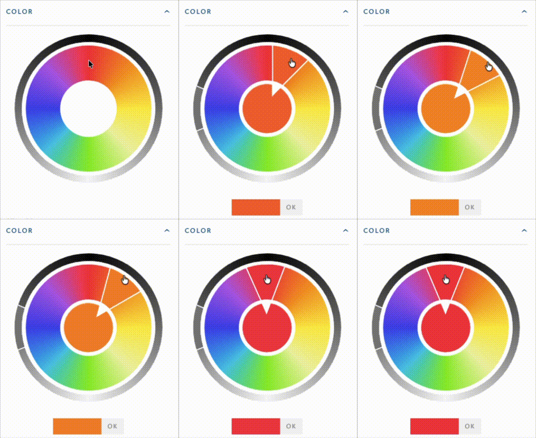
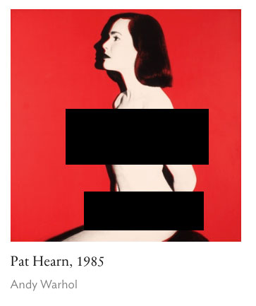
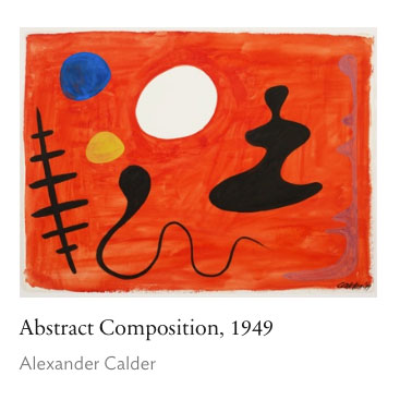
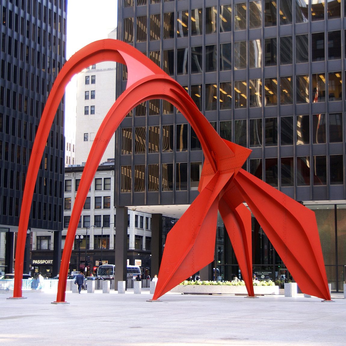
Sure, Andy Warhol’s “Pat Hearn” has a lot of red. But that’s just the background. Alexander Calder’s “Abstract Composition” in 1949 has some interesting resonance. When I think of Calder, I think of his mobiles, which are made of metal. Get it? Metal… aluminum foil. Especially his “Flamingo” sculpture downtown.
But the artist that stood out to me in the results is Robert Rauschenberg.
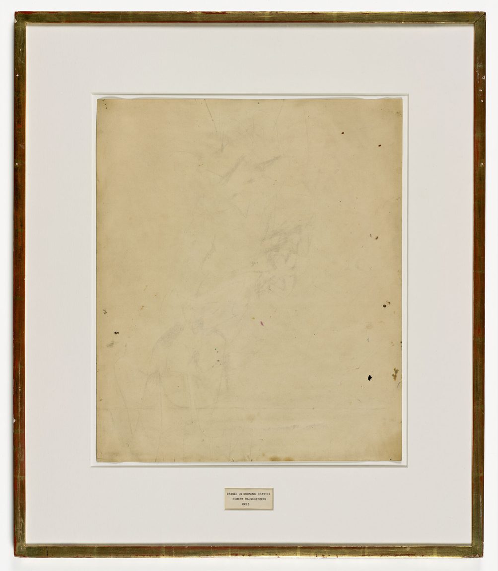
His act of erasing a de Kooning drawing really resonates with me.
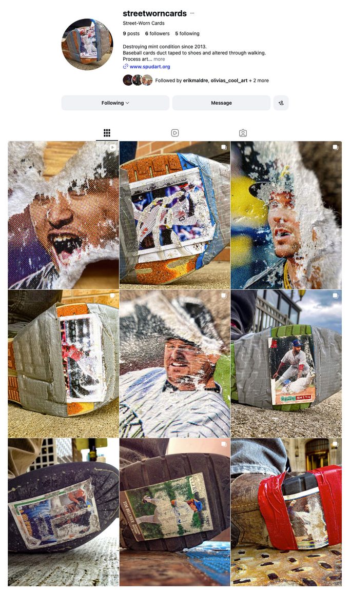
That artwork empowers me to do “Street Worn Cards.” A project where I duct-tape baseball cards to the bottom of my shoe and wear away the card on the sidewalk. An act of erasing something considered valuable.
If Rauschenberg can erase something and call it art, so can I! And in this foil series, something similar happens: the image appears, then disappears.
So yeah, a printout of a Rauschenberg artwork would be perfect to include with this letter.
I like the notion of including an artwork that can be reflected in the foil by the recipient. The recipient can re-enact what was in the foil when I wrote the letter. There’s a bit of a dissonance though, because I didn’t reflect a Rauschenberg artwork when I wrote the letter. I reflected a red quirky storefront.
I’m putting that storefront on par with the Rauschenberg artwork.
And then when we dig deeper into what this Rauschenberg artwork actually is, oh man. It gets REALLY good.
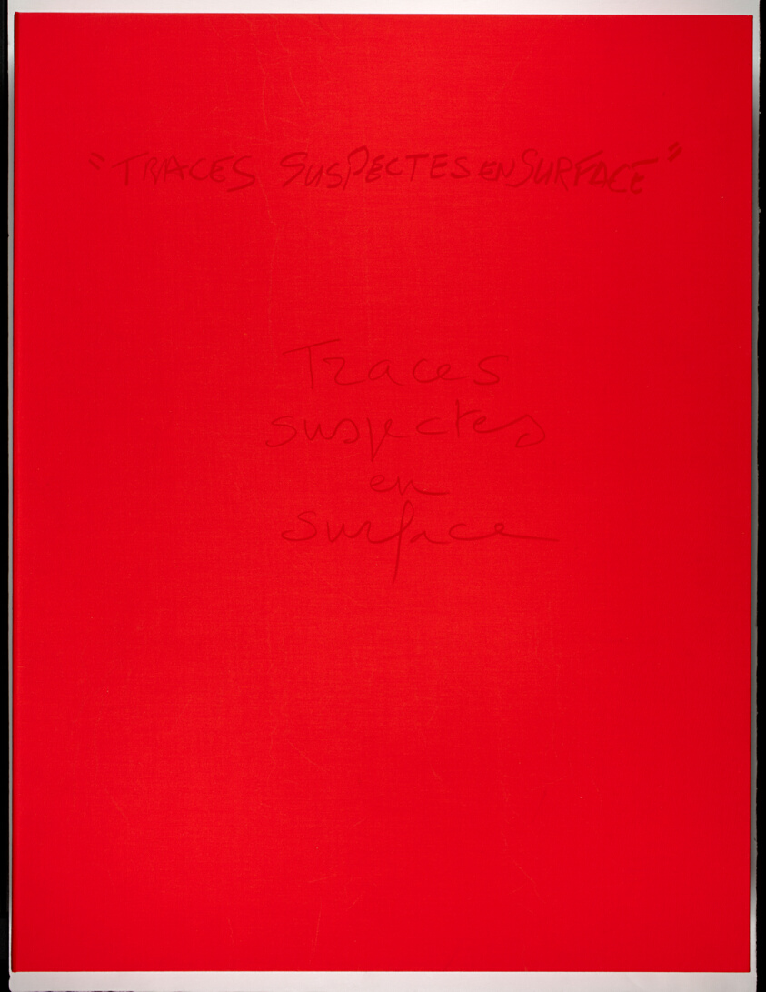
Oh what is the artwork again? It’s “Box from Traces suspectes en surface” from 1972–78. I asked Gemini, “What does Robert Rauschenberg’s “Box from Traces suspectes en surface” mean?”
I’m just gonna paste in the entire Gemini description of this artwork. Because when I read it, I like, flipped OUT.
The phrase “Box from Traces suspectes en surface“ refers to the striking red cloth-covered clamshell portfolio box that houses the 1978 artist’s book and lithograph portfolio titled Traces suspectes en surface (Suspicious Marks on the Surface).
This landmark project was the result of a six-year cross-disciplinary collaboration (1972–1978) between American pop/avant-garde artist Robert Rauschenberg and French “Nouveau Roman” (New Novel) novelist and filmmaker Alain Robbe-Grillet.
The “meaning” and concept behind the box and the project as a whole can be understood through several key layers:
1. The Literal and Conceptual Container
- The Clamshell Box: The red cloth box itself acts as the physical threshold and architectural container for the project. In Rauschenberg’s oeuvre, containers, boxes, and “combines” often serve to gather disparate, everyday elements into a single, unified space.
- Surface vs. Depth:The title translates to Suspicious Marks on the Surface. This reflects Robbe-Grillet’s literary philosophy (and Rauschenberg’s visual style), which rejects deep, hidden psychological symbols in art. Instead, they emphasize that meaning is right on the surface—in the physical traces, marks, textures, and fragments we leave behind. The box holds loose sheets of text and lithographs that invite the viewer to look at the “traces” (images, words, prints) rather than searching for a hidden narrative core.
2. The Intersection of Image and Text (Livre d’Artiste)
- Rather than Rauschenberg simply illustrating Robbe-Grillet’s text, or Robbe-Grillet writing a story about Rauschenberg’s art, the project was conceived as an “image-text” dialogue.
- Robbe-Grillet’s writing relies on meticulous, almost clinical descriptions of physical objects and spaces, playing with illusion, repetition, and perspective. Rauschenberg’s lithographs mirror this by layering photographic imagery, printed text, and abstract marks.
- The box acts as a meeting ground where text and image are given equal weight, forcing the viewer to navigate between reading and seeing.
3. Anti-Narrative and “Suspicious” Interpretation
- Alain Robbe-Grillet was famous for detective-like plots where clues ultimately lead nowhere, subverting traditional mystery storytelling.
- The “suspicious marks” mentioned in the title tease the viewer into thinking there is a crime to solve or a secret message to decode. However, the box ultimately frustrates traditional interpretation. The marks are just marks—fragments of visual culture, textures, and lithographic traces—challenging the viewer to abandon the search for a single, fixed “meaning” and instead experience the interplay of the visual elements.
Like, WHAT!
So many things happening there that are also happening in this Letters on Foil.
- Collaboration. Rauschenberg was collaborating with someone else. Letters on Foil is literally me sending a letter to someone else. This artwork letter would not be possible if I wasn’t collaborating with someone.
- This line: “Instead, they emphasize that meaning is right on the surface—in the physical traces, marks, textures, and fragments we leave behind.” Whuaaaaaaaat! This Letters on Foil is TOTALLY about surface. What reflects in the surface. But I also bring the actual surface to reality by writing on it. It’s an actual material I’m writing on. There are traces, marks, and textures in this surface. Rauschenberg, +high-five+
- “image-text” dialogue. Yup. You bet. Images in the foil exist behind the text. “Forcing the viewer to navigate between reading and seeing.” Yes, please! That is a great interpretation for Letters on Foil, too!
- “detective-like plots where clues ultimately lead nowhere”…. Hmm, I suppose that’s happening in the foil as well. Especially when I start doodling on it. Although for this particular letter, I literally explained what the outlines were. Next time, I could leave them more mysterious.
The plates went in the mail
Here’s the part that flipped me out more than anything in that description. Robbe-Grillet didn’t type his text and hand it off to a printer. He wrote it by hand, directly onto aluminum offset plates. Actual aluminum. Here’s one example of a page.
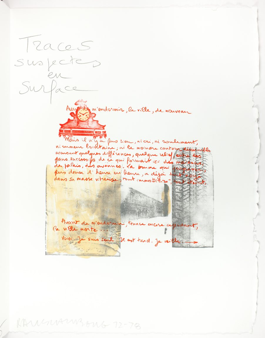
And the plates traveled. Tatyana Grosman shipped them from West Islip, New York to Paris. Robbe-Grillet wrote on them and sent them back. Then Rauschenberg responded with his images on the same plates, and the whole exchange ran from 1972 to 1978.
So: handwriting on aluminum, put in the mail, and a second person adding to the same surface. Six years of it. That’s a guy with a clipboard and a roll of Reynolds, except the guys were Rauschenberg and a French novelist, and they were doing it before I was born.
I spent twenty minutes at a picnic table tracing popcorn kernels onto a sheet of aluminum. The artwork is called Traces suspectes en surface. Suspicious traces on the surface. I’m not making that up; that’s the title. Though the museums can’t agree on the translation either.
- San Francisco says suspect traces on the surface
- The National Gallery says suspicious marks
- Toledo says suspicious tracks near the surface
So here’s what goes in the envelope to Lyle: the foil letter, the popcorn outlines I traced, a few kernels from the store, and a printout of the Rauschenberg. Hold the printout up against the foil and the red comes back into the letter. Not the red from the storefront. A different red, from a box an artist designed in 1978, appearing in Lyle’s hands instead of mine.
I still want to make those business cards with foil glued on the back. Somebody’s going to keep staring at the guy in the green bike helmet writing on tinfoil, and instead of not making eye contact, I’ll hand them a card. Then they can go press it against a brick wall or a stop sign and watch their own little lake fill up.
What would you hold your foil against? Write a letter on it and mail it to somebody. I want to see what ends up in your surface.