
Notepad

Estonian branding on Japanese products

Have you ever been to a Japanese supermarket? I love seeing all these products that are new to me. Every aisle. It’s like walking in another country.
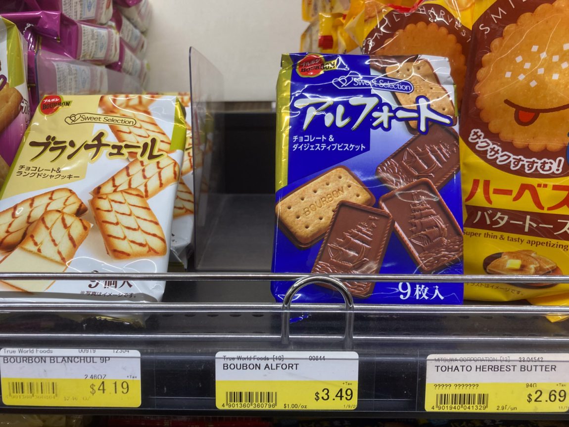
Certainly! Let's break down the image in detail.

**Overall Scene:**

The image shows a close-up view of a shelf in what appears to be an Asian grocery store or a section within a larger store that carries imported Asian snacks. Three different packages of biscuits are prominently displayed, each with a price tag directly below it. The shelf is made of metal wire. Above these featured items, parts of other snack packages are visible on the shelf above, suggesting a variety of similar products.

**Featured Products (from left to right):**

1.  **Left Package:**
    
    -   **Packaging:** A light yellow and white striped package with a clear window showing the biscuits inside. The biscuits are rectangular with a ridged pattern and appear to be coated with a light-colored cream or icing.
    -   **Japanese Text:**
        -   **ブランチュール (Buranchūru):** This is likely a phonetic rendering of a French-derived name.
        -   **チョコレート&ラングドシャクッキー (Chokorēto & Rangudosha Kukkī):** This translates to "Chocolate & Langue de chat Cookie."
    -   **Price Tag:** Yellow tag with black text indicating "BOURBON BLANCHUL 9P" and a price of "$4.19".
2.  **Center Package:**
    
    -   **Packaging:** A bright blue package with a gold and red banner at the top that says "Sweet Selection". A clear window shows the biscuits. These biscuits are rectangular, with a plain biscuit base topped with a layer of milk chocolate featuring the word "BOURBON" embossed on them.
    -   **Japanese Text:**
        -   **アルフォート (Arufooto):** This is likely a phonetic rendering of a foreign-derived name.
        -   **チョコレート&ダイジェスティブビスケット (Chokorēto & Daijesutibu Bisuketto):** This translates to "Chocolate & Digestive Biscuit."
        -   **9枚入 (9 Mai-iri):** This means "Contains 9 pieces."
    -   **Price Tag:** Yellow tag with black text indicating "BOURBON ALFORT" and a price of "$3.49".
3.  **Right Package:**
    
    -   **Packaging:** A large, mostly orange package with a cartoonish smiling biscuit character on the front. The biscuits inside (partially visible) appear to be thin and round.
    -   **Japanese Text:**
        -   **ハーベスト バタートースト (Hābesuto Batā Tōsuto):** This translates to "Harvest Butter Toast."
        -   **うす焼サクサクすすむ! (Usu-yaki Sakusaku Susumu!):** This phrase suggests "Thinly baked, crispy, you'll keep eating!" or something similar emphasizing the texture and appeal.
        -   **super thin & taste appetizing:** This is written in English on the package.
    -   **Price Tag:** Yellow tag with black text indicating "TOHATO HERBERT BUTTER" and a price of "$2.69".

**Additional Observations:**

-   The price tags indicate that the store uses US dollars.
-   The presence of both Japanese product names and English descriptions (on the rightmost package) suggests that these are imported goods intended for an English-speaking market as well.
-   The "Sweet Selection" branding on the left and center packages might indicate a specific product line from the same manufacturer (Bourbon).

In summary, the image showcases three distinct types of Japanese biscuits available for purchase, with clear pricing and product information provided in both Japanese and English (partially). The setting is likely a retail environment catering to customers interested in international snack foods

The midwest’s best Japanese supermarket is in the Chicago suburb of Arlington Heights. I hadn’t visited the store in 20 years. I was dropping off my taxes 15 minutes away from the store, I figured I’d swing by and check it out.

Photo of outside of Mitsuwa Marketplace in Arlington Heights, IL

While walking the aisles of cute products like learning chopsticks for kids, I came across this glue stick product. The packaging was very generic and bland, but what stuck out was these three stacked horizontal rectangles. The top blue, middle black, bottom white. The exact same combination of colors in the Estonian flag.
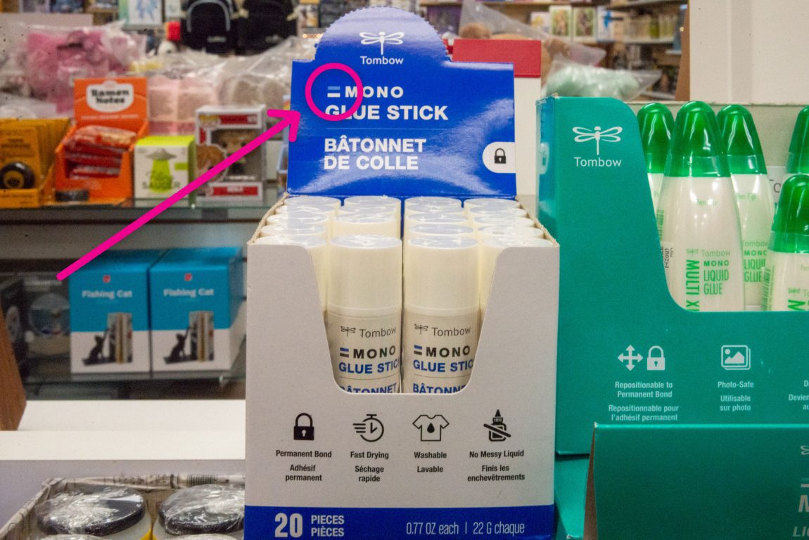
Now, I’m half Estonian. My dad came over to America when he was 4 years old. My last name, Maldre, is a unique Estonian name. We have family pride when it comes to being Estonian. It’s a tiny country most people haven’t heard of. In fact, some people think it’s a fictional country where Encino Man comes from.

Here’s the Estonian flag flying from my house.
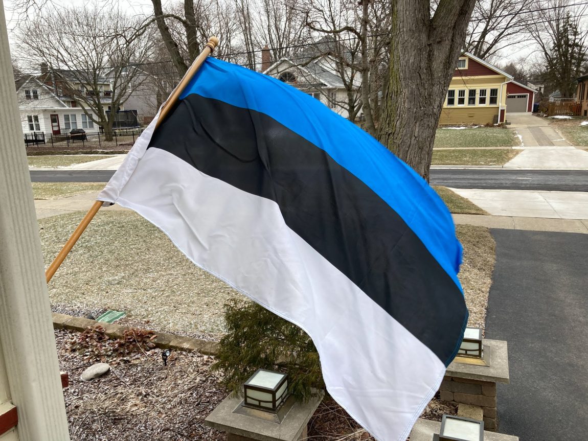
When an Estonian flag appears out of the blue, my brain is trained to identify it right away. When we first moved to Glen Ellyn in the late 2010s, a few blocks down, I noticed a neighbor who had an Estonian decal on his car’s back windshield.

When the flag appears, it sticks out to me.

But to see it at a Japanese supermarket? That’s NOT the place I’d expect it to be. So that makes it stick out all the more.

I had to rub my eyes and retrain my brain. The Estonian flag is white on the bottom, right? Yes. Blue on the top, right? And black in the middle. All three are correct.

An Estonian flag on a product that is exclusively an Asian product. Huh.

What’s up with Tombow using the Estonian flag in their MONO line? Tombow’s about page says, “Tombow was established in Japan in 1913 as a wood-case pencil provider for Japanese students.”

Is there any Estonian connection? Nope.

American connections

American Tombow, Inc. is a wholly owned subsidiary of Tombow Pencil Co., Ltd. that has distributed Tombow branded art and office products in North America since 1983. Tombow was first established in the United States in California, and later moved its North American headquarters to Georgia in 1993. Our offices and warehouse facilities were relocated in 2003 to a larger facility in Suwanee, GA with state-of-the-art technology.

Thailand and Vietnam connections

In the early 1990s, Tombow established its first overseas factory in Thailand to produce products under strict quality control by our production engineers. Until that point in time, all production and manufacturing had been conducted in Japan. Since 2003, Tombow has established three factories in Vietnam.

Germany connection

Additional Tombow subsidiaries are located in Germany and China. Tombow Pen & Pencil GmBH was established in Germany in 1980 and sells Tombow products throughout Europe.

Remember how I said I’m half Estonian? My other half is German. Tombow having a connection with Germany is amusing for me.

China connection

In 2011 Tombow Pencil (Dalian) Co., Ltd. was established as the first sales base in Asia, selling Tombow products to the Chinese market.

Indonesia connection

A representative office was established in Jakarta, Indonesia in August 2019 for market research and sales promotion support in Southeast Asia.

No mention of Estonia on Tombow’s about page. However, they do have a Facebook Page.

Tombow Estonia on Facebook

There is a Facebook Page for Tombow Estonia. Could this be it? Not really. Tombow is an international company so they have Facebook Pages in many other countries, in addition to Estonia.

I sent a message to the Tombow Estonia Facebook Page, asking:

I’m amazed to see Tombow’s line of “MONO” products use an icon of blue, black, and white. The exact same colors are in the Estonian flag. Is there a connection between this blue, black, and white icon in MONO products and Estonia?

I rather doubt they’ll respond, because their most recent post is from March 2023. Over two years ago.

Most likely, Tombow just picked those three colors, because they are awesome colors.

Other Tombow MONO products that use blue, black, and white

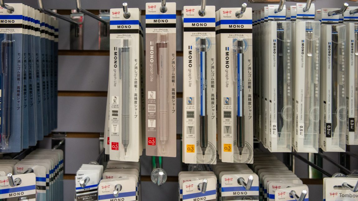
I also picked up a mechanical pencil with the colors. Although this time, the colors are in a different order. So that tells us that the company probably just likes the combination of blue, black, and white.
The image shows a close-up of a retail display shelf featuring "Tombow Mono Plastic Erasers." The focus is on a cardboard display box containing multiple individual erasers. Other similar products are visible in the background, suggesting this is a stationery or art supply section within a store.

**Featured Product:**

-   **Tombow Mono Plastic Erasers:**
    
    -   **Display Packaging:** The erasers are contained in a white cardboard box with a blue and white design. The Tombow logo (a stylized dragonfly) is present, along with the product name "MONO" in a bold font and "PLASTIC ERASER" in a smaller font. The display also has the name of the store "Kinokuniya" on it.
        
    -   **Individual Erasers:** The erasers are white, rectangular prisms encased in a thin paper sleeve. The sleeve has the brand name "Tombow" and product name "MONO." The visible part of the eraser is white.
        
    -   **Text on the display box:** There is Japanese text on the display which says:
        
        -   事務・製図用高性能消しゴム。 (Jimu・Seizu-you Kouseinou Keshigomu.) - This translates to "High-performance eraser for office and drafting use."
            
        -   消字力が強力で消しカスが少ない。 (Shoji-ryoku ga Kyouryoku de Keshikasu ga Sukunai.) - This translates to "Erases powerfully and produces little eraser dust."
            
    -   **Pricing:** A price tag is visible, indicating "1.95". Another price tag shows "1.20".
        

**Surrounding Products and Background:**

-   Several more boxes of Tombow Mono erasers are stacked behind the featured display.
    
-   The shelves are a light color.
    
-   Other products are slightly visible in the blurred background.
    

**Overall Impression:**

The image showcases a retail display of Tombow Mono Plastic Erasers, emphasizing their quality and suitability for both office work and technical drawing. The Japanese text highlights the product's performance, and the overall presentation is clean and organized.

The plastic eraser uses the colors, but also in a different order than the flag.
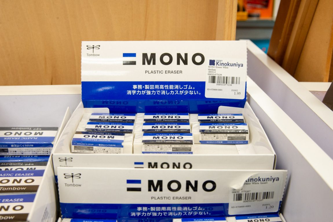
The image shows a close-up of a retail display shelf featuring "Tombow Mono Plastic Erasers." The focus is on a cardboard display box containing multiple individual erasers. Other similar products are visible in the background, suggesting this is a stationery or art supply section within a store.

**Featured Product:**

-   **Tombow Mono Plastic Erasers:**
    
    -   **Display Packaging:** The erasers are contained in a white cardboard box with a blue and white design. The Tombow logo (a stylized dragonfly) is present, along with the product name "MONO" in a bold font and "PLASTIC ERASER" in a smaller font. The display also has the name of the store "Kinokuniya" on it.
        
    -   **Individual Erasers:** The erasers are white, rectangular prisms encased in a thin paper sleeve. The sleeve has the brand name "Tombow" and product name "MONO." The visible part of the eraser is white.
        
    -   **Text on the display box:** There is Japanese text on the display which says:
        
        -   事務・製図用高性能消しゴム。 (Jimu・Seizu-you Kouseinou Keshigomu.) - This translates to "High-performance eraser for office and drafting use."
            
        -   消字力が強力で消しカスが少ない。 (Shoji-ryoku ga Kyouryoku de Keshikasu ga Sukunai.) - This translates to "Erases powerfully and produces little eraser dust."
            
    -   **Pricing:** A price tag is visible, indicating "1.95". Another price tag shows "1.20".
        

**Surrounding Products and Background:**

-   Several more boxes of Tombow Mono erasers are stacked behind the featured display.
    
-   The shelves are a light color.
    
-   Other products are slightly visible in the blurred background.
    

**Overall Impression:**

The image showcases a retail display of Tombow Mono Plastic Erasers, emphasizing their quality and suitability for both office work and technical drawing. The Japanese text highlights the product's performance, and the overall presentation is clean and organized.

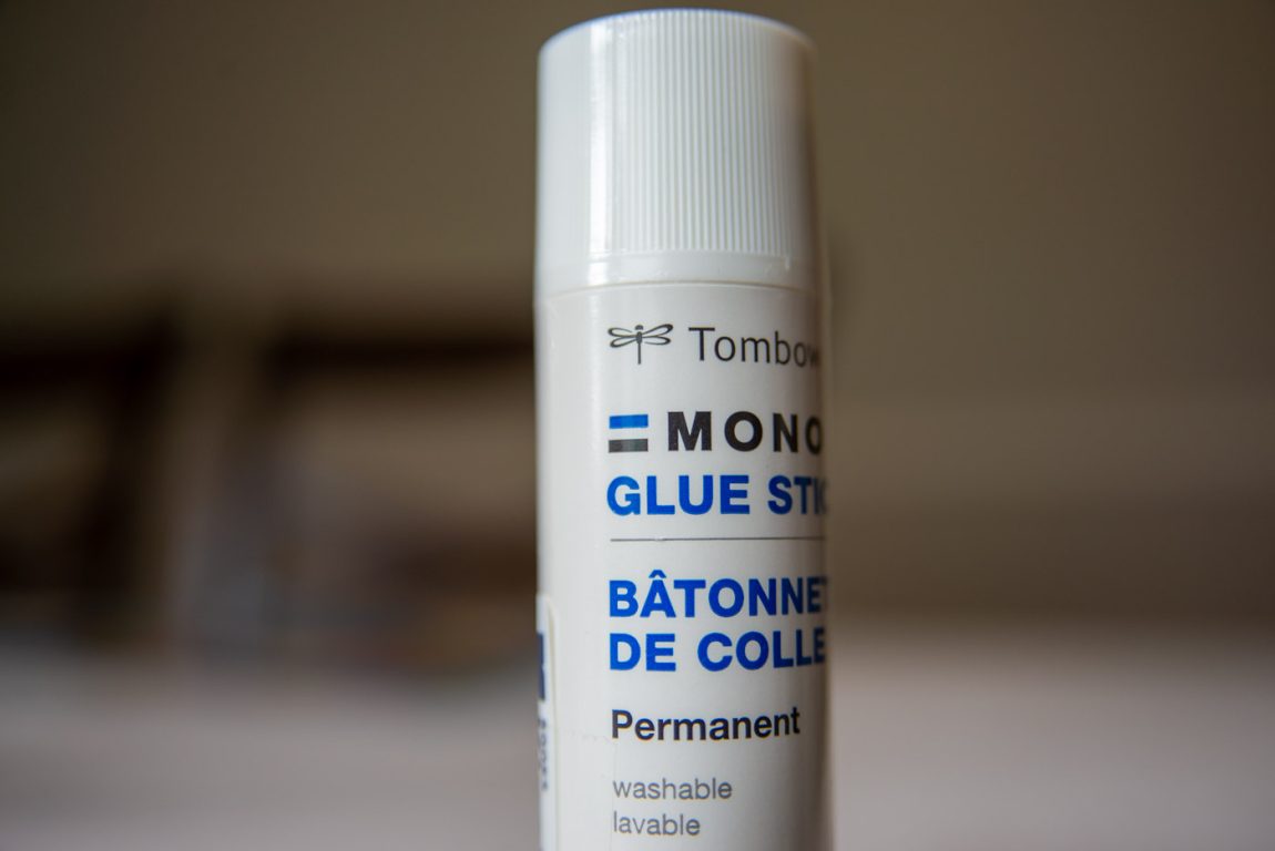
Looking closer at the glue stick itself, the colors are out of order here too. (the colors on the display case had it in the correct order)
Subscribe
Notify of
guest

This site uses Akismet to reduce spam. Learn how your comment data is processed.

0 Comments
oldest
newest most voted