

Einstein was a genius when it came to physics, but here’s a genius idea for spreading a bit of his wisdom: recreate his famous “theory of happiness” note and share it with friends. In this post, I’ll show you how to print your own replica of Einstein’s million-dollar message, both in the original German and in English, using a font based on his own handwriting. But before we dive into the DIY details, let’s revisit the fascinating story behind this priceless tip:
In 1922, Albert Einstein was touring Japan. At his hotel, a bellboy delivered him a message. Einstein didn’t have cash to tip him. So instead, he wrote down his theory of happiness on a piece of paper and gave it to the bellboy. Recently, that note sold for 1.5 million dollars making it one of the highest tips to date. What Einstein wrote was this: ‘A calm and modest life will bring more happiness than constant pursuit of success combined with constant restlessness.’ The note may be worth 1.5 million dollars, but the words… priceless.
What an intriguing story! I was curious what the note looked like, so I found it online.
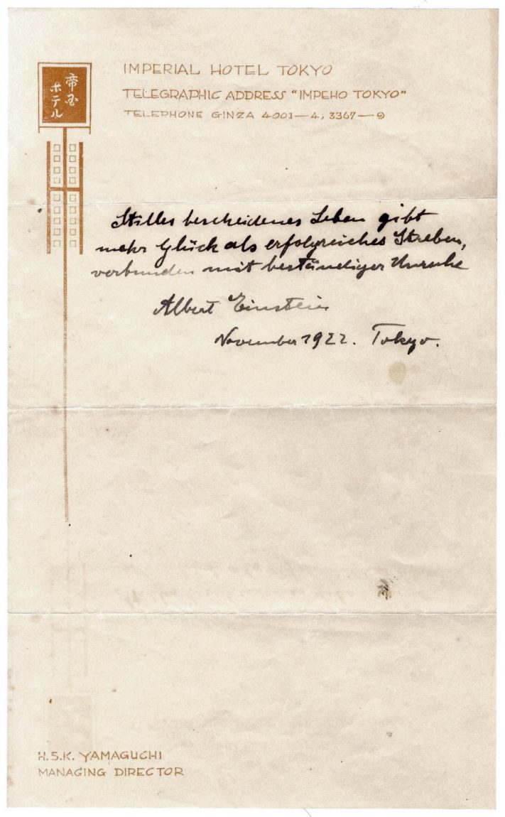
Of course, the text is in German, because that’s Einstein’s primary language.
Stilles bescheidenes Leben gibt
mehr Glück als erfolgreiches Streben,
verbunden mit beständiger Unruhe.
I’m going to print the original note, and trim it to the actual size (13×21 cm), and fold it in the same foldmarks. It would be fun to mail this note to someone. Imagine getting a note that’s worth 1.5 million dollars. To the person receiving the note, it might be a big of a mystery if he/she does not speak German. Later on, you could reveal the meaning behind the letter and who originally wrote it.
If you’d like to mail someone this note, I made a printer-ready PDF that takes the original size of this note (13×21cm) and puts it onto an 8.5×11 sheet.
You just print it out, and cut it out. When you fold the letter, try to fold it on the same fold lines that the bellboy used.
Einstein’s ‘theory of happiness’ note in English
It would be nice to have the immediacy of seeing this note written in English. If we run that image into Google Translate we get:
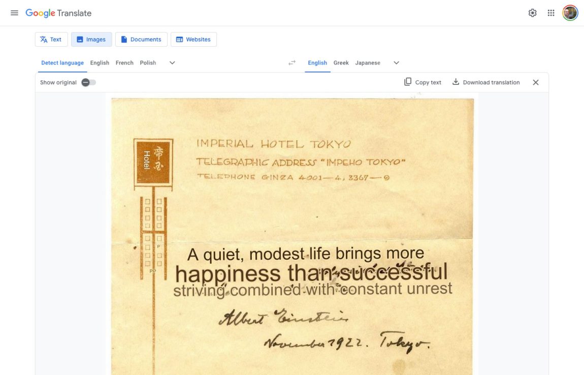
A quiet, modest life brings more happiness than successful striving combined with constant unrest.
Heh. Google Translate confuses the meaning. I looked up a bunch of articles about this quote, they all use the same translation to English:
A calm and modest life brings more happiness than the pursuit of success combined with constant restlessness.
Let’s put the actual English translation into the note. While we are at it, let’s use Einstein’s handwriting. Years ago font designer Harald Geisler took Einstein’s handwriting and meticulously made a font from it. Actually, he made five styles, each with a variety of weights. When this font had a Kickstarter, I purchased the full set.
Einstein’s handwriting on this note is pretty condensed, so I’m using “Style 03” which is the most compact of all the Einstein font styles. The text is pretty thick, so I’ll use the heaviest weight, which is Black.
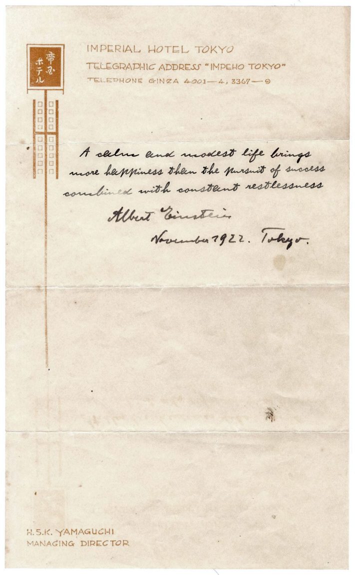
As with any handwriting text, it can look a bit forced, because the baseline is so straight. I adjusted the height of the baseline for some of the words, moving them up or down, so there’s a more natural flow.
If you prefer to send this English version to your friends, here’s a printer-friendly PDF that will allow you to print it on a 8.5×11 sheet.
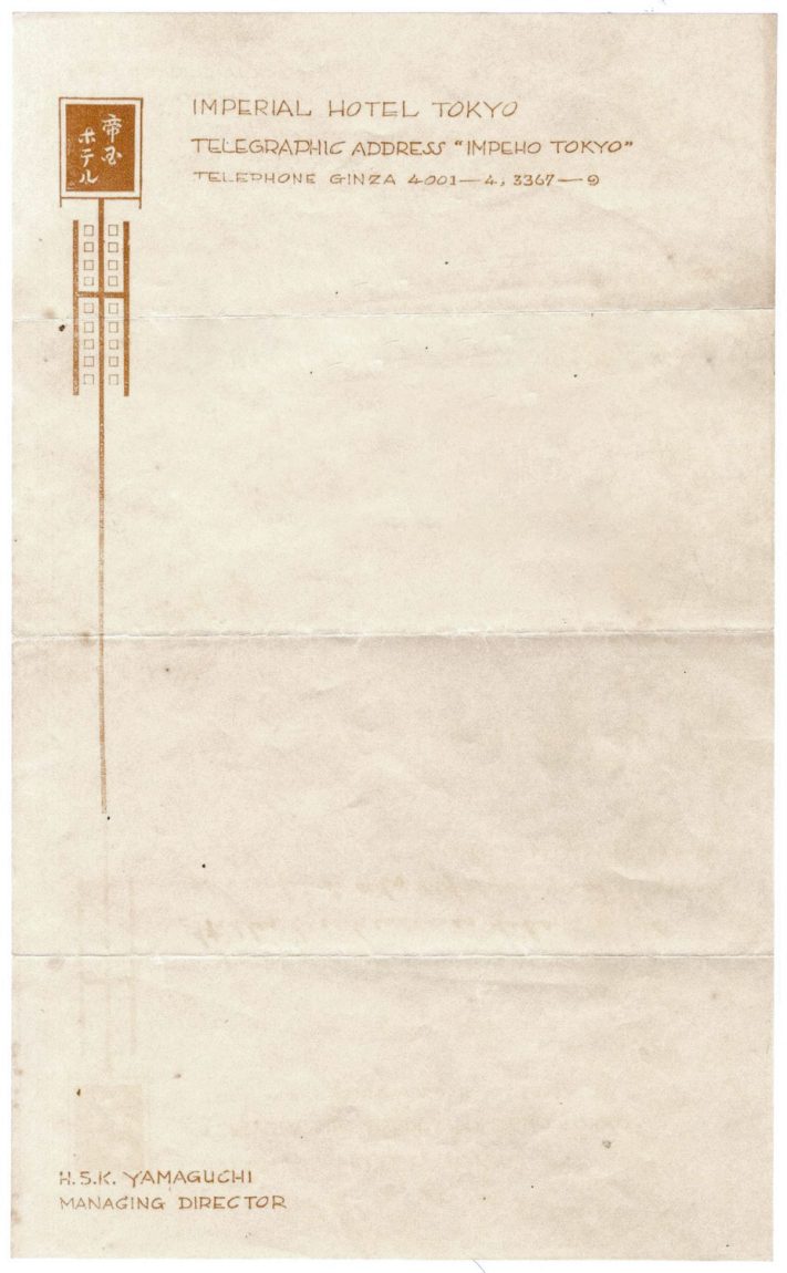
Your own blank letterhead
If you’d like to write your own note on this letterhead. Here’s a blank version, all ready for your wisdom to share. Again, printer-ready PDF for your delight.
Get your own complete set
Here’s what a printed set looks like together. Download all three PDFs and mail them to a friend! (German, English, and blank)
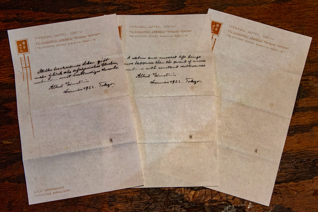
I love the font used on the hotel stationery. Does it reference Frank Lloyd Wright’s architectural plans?
Oh interesting connection. Frank Lloyd Wright designed the main building of the Imperial Hotel Tokyo. He was commissioned in 1916. There are reviews of the building in 1922, implying the building was completed in 1922. Therefore, Einstein’s visit to this Hotel would have been in its first year when it was brand new. Although the hotel’s website says it was inaugurated on September 1st, 1923.
I’d imagine this letterhead is done in the style of Frank Lloyd Wright. Although, it doesn’t copy his handwriting. Check out Wright’s plan for the building. In the upper right is some of his writing. .webp?itok=bpa7TzgM (Image comes from https://www.imperialhotel.co.jp/en/tokyo/special/wright-building)
Although, now that examine this plan closer, there is some light text in the upper left. It’s in a more casual style than the text in the upper right. This more casual text does indeed look a bit like the text of the Imperial Hotel Tokyo letterhead.
Another piece of fun trivia about this hotel. Marilyn Monroe and Joe DiMaggio stayed at this hotel on their honeymoon. Too bad the building was torn down 1967. But it looks like they are currently rebuilding it in a 15-year project.
As long as we’re on the subject of bon mots from Einstein, check out his list of rules for his first wife. The man sounds insufferable.