

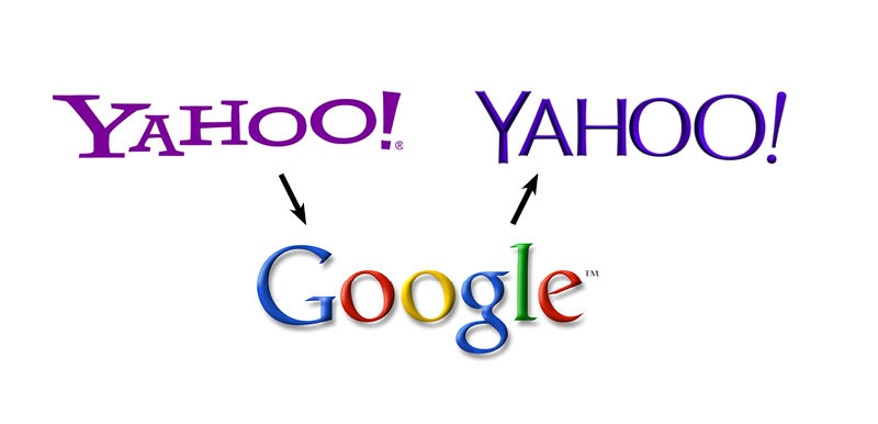
Yahoo trying to be like Google
Google has an embossed logo. Yahoo now has a beveled logo.
Google has a logo with super-thins. Yahoo now has a logo that is very thin.
Google does many variations on their logo. Yahoo did many variations on their logo.
Google trying to be like Apple
Google reacts to Yahoo’s copycat action, “What in the world is Yahoo thinking? Trying to copycat us. Pppph. Let’s change our logo to shun them. Hey, that new Apple iOS7 flat design is pretty nice. Let’s copycat that.”

Google flattens their logo to look like Apple.
How will Apple react?
But you know what? I’m happy for change of any sort. Although Yahoo’s new logo is really weak. But Google’s improved ten-fold. I’m hoping that Google’s logo today is just not them paying homage to something.
Google going monochrome would be much like the evolution of Apple’s brand. From embossed rainbow-colored logo. To flat rainbow-colored logo. To simple gray logo. Everyone was so upset when Apple ditched the colors in the icon. I’m sure the same will happen when Google does it.
I wouldn’t be surprised if Google went to a monochrome logo in the next five years. The da Vinci style serif really never worked with the circus colors. They’ll probably go all blue since that’s the only color that’s duplicated in the logo right now. Then two years later they’ll go to a darker blue.
Your insight into companies influencing companies is spot-on. Yahoo! had to do something about their logo, but they overthought it and the final logo doesn’t work very well for various reasons.