

I’ve noticed a pattern when opening logos from other companies—the black is often never truly black.

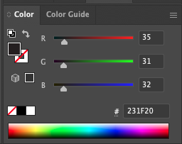
Here’s the colors used to make this fake black:
- Red: 35
- Green: 31
- Blue: 32
But true black should be:
- Red: 0
- Green: 0
- Blue: 0
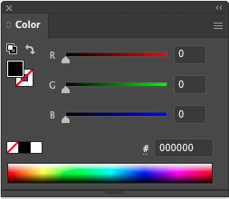
You can tell the logo came from a legacy CMYK environment, and someone converted it to RGB without adjusting it to true black.
Here’s the comparison again:
Looking at these two blacks side by side, I couldn’t help but think of Josef Albers’ paintings—especially “Midnight + Noon II” from 1964 at the National Gallery of Art.
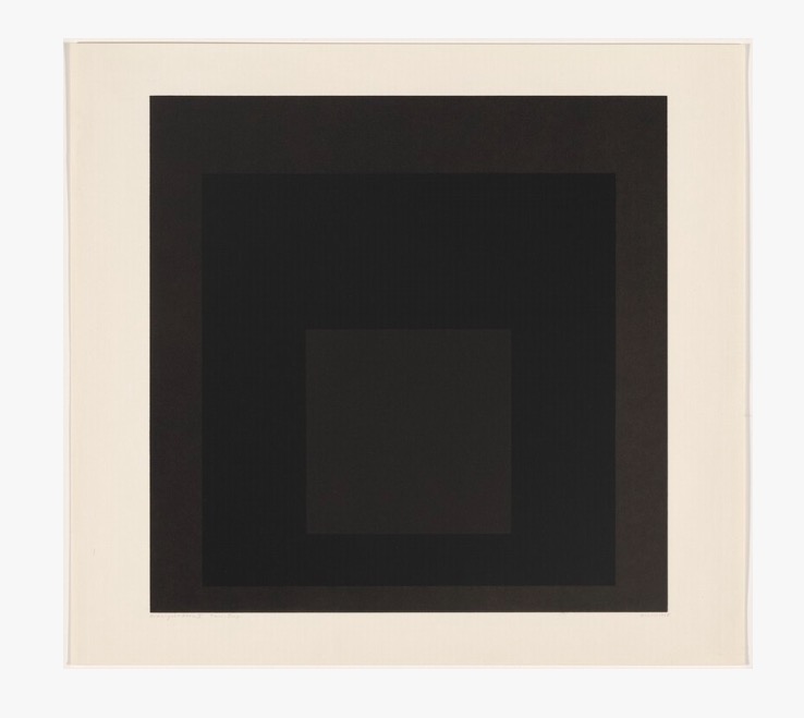
My screenshot looks remarkably close to Albers’ painting. Does that make it a work of art? If so, I’m calling it “#231F20 vs #000000.”
The depths of black reaches into the inner soul, and the inner computer monitor.