


People often give me a hard time when I say my favorite color is gray. “Gray? Really?” they ask, as if I’ve chosen something lifeless or dull. But gray is anything but dull. It’s adaptable, versatile, and full of quiet strength. It carries the hues around it, reflecting the colors nearby while maintaining its own presence. It’s calm, sophisticated, and, honestly, a bit underrated.
Back in 2021, when Ultimate Gray was named Color of the Year by Pantone, I felt vindicated. Finally, the world was recognizing what I had always known: gray is a powerhouse. It’s the ultimate companion color, able to enhance and transform depending on what’s next to it. If gray sits beside blue, it takes on blue’s depth. Next to red, it picks up warmth. Gray is the chameleon of colors, effortlessly working with whatever surrounds it.

The Moon: a landscape in gray
Maybe my love for gray is also why I’ve always been fascinated by the moon. The lunar surface is a vast, textured landscape of grays, stretching endlessly in every Apollo mission photo. The moon is real, yet it often feels like an abstract place—something distant, reserved for astronauts and legends. But at its core, it’s just another place. A rocky expanse, not unlike a beach, just with fewer visitors.
I once spent 15 minutes downloading every single photo from an Apollo mission gallery—165 images of pure lunar wonder. I wanted to immerse myself in the grayness, to see every rock, every shadow, every crater. Someday, I’d love to take a room and cover the walls with these moon rock photos, creating a space where you’d feel like you were standing on the moon itself. For now, I make printouts of moon rocks at actual size and leave them in public spaces. Here’s a nice gray one with gray in the photo.
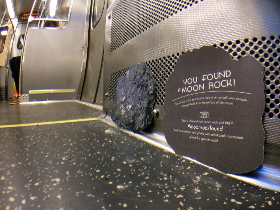
Gray: A color of possibility
Gray isn’t empty or lifeless. It’s a color of potential, of transition. It’s the sky before a storm, the quiet of a snowy day, the in-between space where things shift and evolve. People may find it odd that I love gray, but to me, it’s the perfect color.
And if nothing else, at least I can say the moon agrees with me.
A psychologist also agrees about gray. This article was mostly about black, but has a few good paragraphs about gray.
Wearing gray could be favorable, according to psychologist research
Although wearing gray may appear unremarkable, this psychologist contends that it is anything but. Perceptions and emotions are influenced by the layers of meaning contained in this seemingly neutral color. Gray has a big impact on art and fashion, according to a study on the color’s psychology. Gray is a wardrobe must because of its adaptability and understated elegance, even though some people equate it with aging or melancholy.
Gray has traditionally been associated with simplicity and humility. Monks and the working class wore this modest shade in the past as a mark of poverty. Gray has evolved over the ages from being associated with austerity to being associated with refinement, particularly in contemporary fashion. Why, therefore, is gray a popular color these days? Let’s examine the underlying symbols and science considering the previously mentioned psychologist research. When it comes to apparel, gray can adapt to every situation like a chameleon.
According to this psychologist, wearing gray conveys a sense of neutrality and approachability. It’s the perfect color for professional settings because it doesn’t overpower. For instance, a well-tailored gray suit conveys sophistication, poise, and confidence without being overt. For individuals who would rather blend in, gray is likewise a popular choice. Its subtlety enables people to blend in without attracting undue notice. However, gray’s impact can be changed by combining it with bright colors, which provide an ensemble vitality and uniqueness.
Viva la gray!
I’ve always been a fan of gray especially in clothing and wall paint. Not a fan of gray skies, though.
Oh, good point about the wall paint. Yeah, gray is really nice for wall paint. It can take on so many different tints.
A newspaper where I worked had the walls in the photography department painted 18 percent gray.
This 18% gray is very interesting. The link says, “An image of an 18% gray card should reveal a histogram with one pixel width in the very center of the histogram.”
I gave that a try in Photoshop. The histogram doesn’t show the line in the center of the histogram. Maybe I need to photograph the histogram instead of making it from scratch in Photoshop.
Here’s a screenshot of the histogram in Photoshop.
A Marshall Field’s menswear associate once assured me that gray is the new black.
One aspect of gray that annoys me is its overuse on the web and in printed material from Apple Inc. Light, light, light gray is a complete fetish among designers. And I defy anybody to read the voltage and wattage information on an Apple power adapter.
*Said in brainwashed voice* liiiight gray… oh yes… like light liiiiight graaaaay
Then there’s also the gray man theory. It maintains that there is safety in being prepared for any situation, but not appearing so to the untrained eye.
The 5.11 Community suggests that you want to look like everyone else does in whatever situation you are in:
I don’t have a favorite color. When people ask what my favorite color is I say “not yellow” … which is wild because gray and yellow are great together!
“Not yellow.” That’s hilarious. That’s like the last thing people expect when asked, “what’s your favorite color?”
Man. I wish I had a not-favorite color. Trying to think… is there a color I have a hatred for… I can’t think of any. Although when you mix a smidge of black with yellow, you end up with a putrid color. Although, dirty ochre is… I’d say it’s sophisticated. People wouldn’t expect to see ditry ochre used in most contexts. But man, it would look great with a white and black.
You could list some color that humans can’t see. Like infrared or ultraviolet blue. Then follow that up with some sort of line like, “you can’t even see that color! How stupid is that‽” But in all reality, that just makes those colors even the more cooler. I bet there are some humans who can see either infrared or ultraviolet. That’s like a superpower!
Someone could answer with the colors of their sports rivals. But I don’t support antagonism between sports teams. It’s just petty and pointless.
What’s something I really don’t like. Oh I know. Instagram. Ok, maybe I could answer, “not gradients that go from purple to magenta to red to orange to yellow.” Then the person coudl say, ‘ooook, that’s oddly specific. why not?’ Then I can go into my rants about instagram. But in all reality, not liking the purple-magenta-red-orange-yellow gradient would be really limiting to anything with rainbows. And that’s not cool.
Oh I got it. I’d say, “not burnt orange” Why? That’s the color of Trump’s fake skin! BAM! #micdrop.
About 20 years ago when starting to update my design portfolio, the opportunity was there to rebrand. I was curious to see what I could do with a color I really didn’t like at the time… yellow. And not a warm golden yellow or light pastel yellow, but yellow yellow. It was a fun project with good results.
But that’s color within the realm of graphic design which I always approached externally rather than internally. You won’t see me painting any walls the same yellow. My basement, when we purchased, was yellow and stone blue. Horrible combo. Changing the yellow to a very neutral white completely changed the vibe.
orange. That’s been my #1 since I was a kid. We rode long hours on the school bus every day and got a good experience of the southwest side of Chicago. Because of its rarity, it was a treat to see anything orange (besides construction fare) and so I decided it would be my favorite color.
For a second I thought you were referring to the bus being orange (which it’s yellow, maybe with a slight tinge of orange added to the yellow). But I see you are referring to what you see outside the busy while riding along. So you would try to find anything orange? My kids play that game all the time with cars. They start off with finding a red car, then orange, then yellow, and on through the rainbow. It’s rather surprising how often they can find an orange car.
My neighbors across the street had a tiny orange car for years. Just last week, they switched it out for a tiny yellow car. Funny how orange and yellow has come up in the comments.