Tag: Color
19 posts
- The color palette of croquet in the 1920sCroquet has two personalities. One is pristine lawns, all-white clothes, and strict rules. The other is blasting your opponent's ball into the bushes and inventing rules like "no boundaries." Turns out The New Yorker has a connection to both.
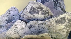
- Why gray is my favorite colorIn 2021, gray was the Color of the Year. I felt vindicated. People laughed when I said gray was my favorite color—until the world finally caught up.
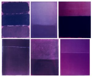
- Let’s color some Rothko paintings purpleSir Elton John owns colorized Rothko prints that are all purple.
- What would you do with the paint used on yellow pencils?An exploration of the color yellow in pencils
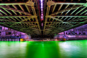
- Intensely green river turns air purpleWhile walking along the Chicago Riverwalk with my wife, the river had just been dyed green hours earlier for the annual St. Patrick’s Day festival. The river has a surreal green glow that could be seen in the metal under…
- Every single Pantone color to get a nameIt would be really cool to name every single Pantone color. All 1,677 of them. Better yet, why not have a website where people can submit their own names? Colorhexa has 746 color names. Colourlovers.com blows them out of the…
- List of official team colors for professional sportsThere should be a list of the official team colors for professional teams. So I’m starting one here. I’m accepting the colors for any team in the NHL, NFL, MLB, and NBA. Seeing that I’m a designer for the Tribune,…
- Pantone’s top ten fashion colors for spring 2007 Here’s the official forecast for spring 2007 colors from Pantone. Which one of these colors is your favorite? Offical Pantone Color My Comments PANTONE 12-1206 Silver Peony C= 3 M=13 Y=15 K “My flesh” This is the nudie shirt color…
- Pantone’s color palette predictions for the 2007 Home Pantone, Inc., the global authority on color and provider of professional color standards for the design industries, unveiled PANTONEView Home 2007, the eight most directional color palettes for the home furnishings market for 2007. Here’s one of the eight palettes:…
- Glidden’s Color of Year for 2006: Golden KiwiGlidden says there’s a new trendy color to follow. Golden Kiwi. As one of the color experts says, it’s a “sophisticated gold with a teeny bit of green in it.” There’s controversy over this color. Veteran color forecaster at Pantone,…
- Pantone Forecast: Spring 2006 Top Ten ColorsFashion in a “Blue” Mood for Spring 2006. Pantone released their spring 2006 colors. Source: “Blue Skies Ahead” on pantone.com Pantone also released a 24 page pdf with suggested color palettes by famous designers. Here’s a quick image with all…
- Order of color namesA color question someone asked me recently: What color are tennis balls? I replied “yellow green.” But some people reply “green yellow.” The debate is… when you describe a color using two words, where do you put the major color?…
- Pantone’s top ten fashion colors for fall 2005Source: “Moroccan Blue’ Leads Top Fashion Colors for Fall 2005” on creativepro.com And I made an illustrator file with the swatches if you want to import it into Adobe Illustrator. 2005colors_womensclothes_v8.zip
- Leatrice’s Lessons: Part 4 of 4: Color Trends Lasting longer than they shouldThe movie Shrek brought out lime green. Normally, lime green would have died a long time ago, but thanks to the sequel of Shrek, lime green stayed on the radar. Movies with sequels that have the main character in a…
- Leatrice’s Lessons: Part 3 of 4: Hot Color CombinationsA hot combination is to include brights into a palette of neutrals. Peach, toupe, pale mauve with rich brass and coppers. 2005 will see more bronzes and coppers. Meanwhile, 2006 will see a marriage of silver and gold. A lot…
- Leatrice’s Lessons: Part 2 of 4: Determining Upcoming Color TrendsLeatrice often looks at movies that are in production and what colors will be emphasized in those films. And, of course, fashion. Leatrice and the Pantone Color Insititute talk to designers and query them about the colors they will use…
- Leatrice’s Lesson: Part 1 of 4: Looking at color differentlyEvery Monday for the next four weeks, we’ll have a new feature called Leatrice’s Lessons. Leatrice Eiseman is the Executive Director of the Pantone Institute. Here are some things she mentioned while giving a talk for a breakfast given by…
- Favorite Pantone Color I don’t know how many graphic dorks we have on here (I know we have a few), but what is your favorite pantone color? A folder solid flush with 021. Bam! talk about bright!
- Pantone Matching System When designers are talking about a PMS color, they are speaking about the Pantone Matching System. It’s quite a ubiquitous term in the industry to say, “oh i wanted a PMS 186 on that job.” But click here to check…